Challenge
Showcase Lick’s mission for sustainability and what they are doing to achieve this.
Solution
Create a dedicated sustainability section of the website
Services
- Content curation
- Wireframing
- UX design
- UI design
- Copywriting
Background
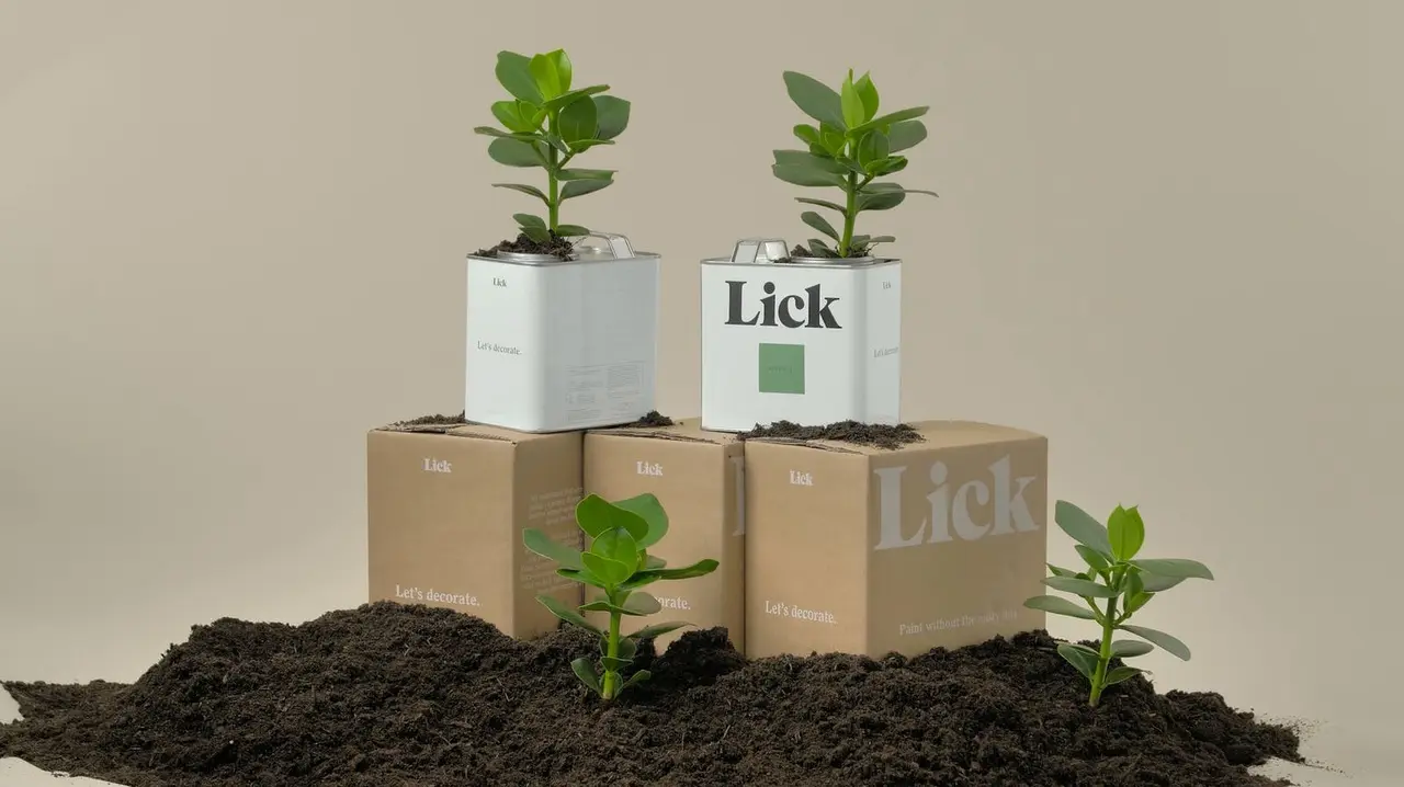
Lick is a disruptive home decor brand with sustainability and user experience at its heart. The brief was to provide Lick’s potential customers with more information about the eco-friendly credentials of their products and charity partnerships. Furthermore, they wanted customers to understand how their purchase directly helps to protect the environment. The scope was limited and a fast turnaround was required.
Approach
Content review and drawing inspiration
I extracted key elements from Lick’s annual sustainability report to form the basis of the content for the page. Next I collated snippets from the sustainability pages of various brands for inspiration. I ran the client through the snippets and together we starred UI patterns and content we liked.

Inspiration review
To bridge the gap between inspiration gathering and designing, I reimagined the inspiration as wireframe components. This meant that the next stages could focus on content and layout.


Wireframe component exploration
Concept direction
Most of Lick’s traffic comes through mobile, so I took a mobile-first approach to the design but presented layouts for mobile, tablet and desktop for review.
The client was keen to keep the execution straightforward. With this in mind, I put together two concepts: a simple static page and a more advanced concept with several UI patterns and interactive elements. After presenting both to the client, they saw the value in the advanced concept and agreed to increase the scope to deliver it.

Wireframe iteration
Copy
To match the brand’s tone of voice, I drafted fun and engaging copy.
“Painting the way to a greener future”
“The writing’s on the wall(paper)”
“A bunch of show offs: All of our ranges boast eco-friendly credentials”
Deliverables
Sustainability hub
The final deliverable was UI design and copy direction for the sustainability hub page across mobile, tablet and desktop. Note that imagery and iconography here is placeholder.


UI designs (Placeholder images and icons)
Basket messaging
Beyond the sustainability hub page, I noticed an opportunity to let the customer know the exact positive impact of their purchase from the basket. This feel-good message might also be expected to increase conversion – a win-win!