Challenge
Improve the UX of the in-car Radioplayer app.
Solution
UX redesign with user testing validation.
Services
- Wireframing (sketching)
- UX redesign
- Semi-formal user testing
- UI oversight
Background
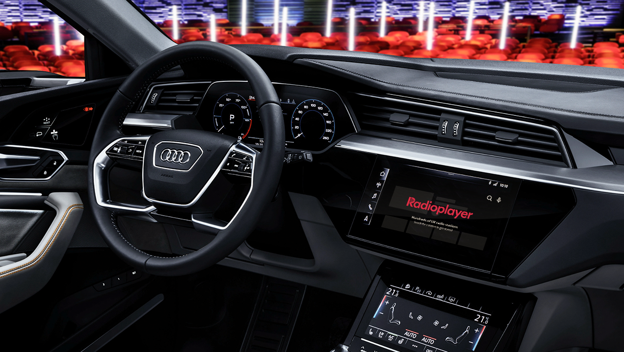
Radioplayer is a non-profit partnership between the BBC and commercial radio. Their “aim is to keep radio listening simple”. They planned to launch an in-car app for Android Automotive.
Some designs for the app existed, but weren’t validated. The brief was to ensure the UX and design of the app met their goal of simplicity.
Approach
Review of existing app designs
The first step was a page by page and holistic review of existing designs. An example of one page review is shown below:

Example of design critique
- Positioning nav on right side is unfamiliar and seemed odd coupled with left nav native OS
- Favourites duplicated on player and dedicated page through nav
- Splitting A-Z list of stations from search was unnecessary
- Repeated ‘delete’ icon on favourites cluttered screen and could be tapped accidentally
- Play/Stop button lost among visual clutter
- Favourites carry high visual weight, clashing with playing station
The overall concern was the information architecture (IA), which seemed convoluted. The aim for the redesign was to simplify the IA by centering it all around the player page – especially as this is where users would spend most time.
In-vehicle UX considerations
The in-vehicle setting creates a unique set of UX challenges. And in this case the use of the radio will often be secondary to the primary task of driving. The UX is important for safety, as well as usability. When designing the app, it was important to consider the driving scenario and follow Android Automotive’s interaction and design guidelines.

Source: designguidelines.withgoogle.com/automotive-os-apps
Interesting guidelines included:
- Operating restrictions depend on the car’s driving state: parked, idling, moving
- No operation should require removal of both hands from the steering wheel
- Interaction sequences should be interruptible (for example: no drag and drop)
- Touch targets should be a minimum size of 76 x 76dp
Sketching improved UX
Being co-located with the UI designer made it possible to work with low fidelity sketched wireframes. Providing just enough in the wireframes to communicate ideas meant we could rapidly iterate through designs. Sketches were accompanied by verbal description and ongoing discussion.


Rough sketches with discussion meant faster iteration
Preparing for user testing
The goals of the user test were defined as follows:
- User understands what to expect from the car radio interface on first-time use
- User can find a radio station
- User understands ways to find a station: Scroll, voice, write
- User can save favourite stations and switch between them
- User can reorder stations
- User can remove favourite stations
- User can recall recently listened to stations
- Gauge visual appeal based on styling
Having written the user test, it was then possible to support the designer to create a prototype with the scenarios required.
Two user testing sessions would run in parallel. Instruction was provided to another member of the team to facilitate the second session. As this person was new to the role, the script was prepared with follow up questions and made to be as straightforward as possible for a novice.
User testing
We replicated a driving scenario for the user test to provide a more realistic insight into the type of user behaviour and interactions in a vehicle. The setup was simple and affordable, but proved effective.
Method
- User positioned in front of a gaming steering wheel, with pedals at feet and a still image of a traffic jam ahead
- Prototype ran on an iPad positioned in the ‘centre console’
- Users asked to maintain a suitable seating position considering they are waiting in heavy traffic
- GoPro camera recorded user interactions and expressions
Participants
- 9 participants
- Various ages and backgrounds
- All drivers
Facilitating
- 1 facilitator
- 1 observer
- Observations captured on individual post-its

An affordable car setup for more accurate insights
Deliverables
User test analysis
Observations on individual post-its helped keep analysis efficient. They were used in affinity diagramming and the resulting clusters helped identify quantitative and qualitative findings.
Perhaps the greatest surprise to come out of the user testing was that UI patterns repeated from popular media apps did not test well!


Affinity mapping helps derive findings from observations
The user test analysis was presented with a deck covering methodology, highlights, a breakdown of observations with findings, and redesign suggestions.


User test analysis presented in a concise deck
Finalised design
Further hand sketches communicated the fixes to solve any usability issues and the final designs were presented back to the client for sign off.