Challenge
Protect enterprises from cloud security threats and inform IT teams which threats are prevalent.
Solution
Cloud based security platform with a data visualisation dashboard
Services
- Field research
- Product development
- Google Design Sprint lead
- Web app design
- Mobile app design
- UX design
- UI design
Background
Vigilion is a SaaS cybersecurity startup. The founders recognised there was a gap in the market for cloud based security for web services. Vigilion protects organisations against malware and prevents data leaks.
When I joined the project, Vigilion only functioned as a threat protection API. There was no user interface. The founders wanted to develop a SaaS product to sell to enterprises. My role was to lead the design, and guide product development from ideation to saleable product.
Approach
The founders were not cybersecurity experts and were open to learning more about the industry. To support the research, I reviewed IT security reports and attended IP EXPO Europe – an enterprise IT event with a large cybersecurity exhibition.
At the event, I attended speaker series and spoke with industry experts to learn more about current market offerings and trends for the industry. A prevalent theme from my research was that individuals are often the weakest link in the security chain. Through behavioural engineering, hackers can trick someone into exposing access to IT systems.

IP EXPO EUROPE
To improve a company’s security, Vigilion should empower IT security teams to mitigate user threats, as well as provide a technical security layer. I wrote a findings report, summarising the competition, opportunities for growth, and enterprise security needs and vulnerabilities.
Google Design Sprint
To kick off the product development, I ran and participated in a design sprint based on the first three days of the Google Design Sprint. I helped the founders to establish their long-term goal and bring out any product uncertainties to be addressed. Through user journey mapping and ‘How might we’ exercises, I supported the team in picking a target for the sprint.

Google Design Sprint
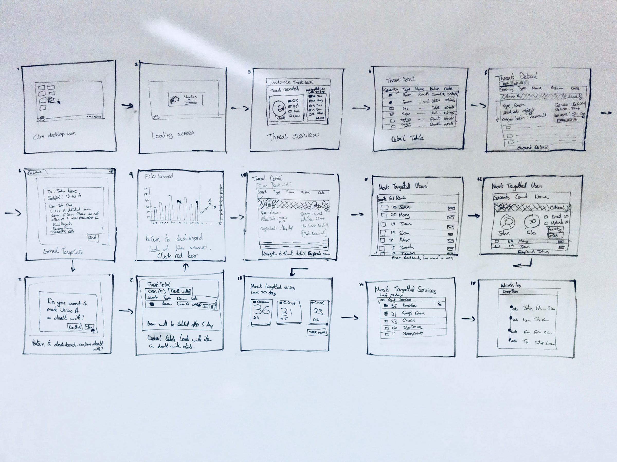
I sparked the creative process by inviting the team to share inspiration from existing products. Myself and team members gave quick demos of inspiration and we made sketch notes of the best existing ideas to remix and improve. Realising that the design process can be daunting, I guided the team through the four-step sketch process: notes, ideas, crazy 8s, and solution sketch.
I facilitated the critique of the solution sketches and drew upon my experience of data visualisation design to shape the product direction. I took the chosen designs and strung them together into a storyboard.
Digital mockups
I was responsible for delivering the full product and visuals for the first iteration of the web app. This included designs, interaction notes and developer handover. I used Sketch to create the UI mockups.
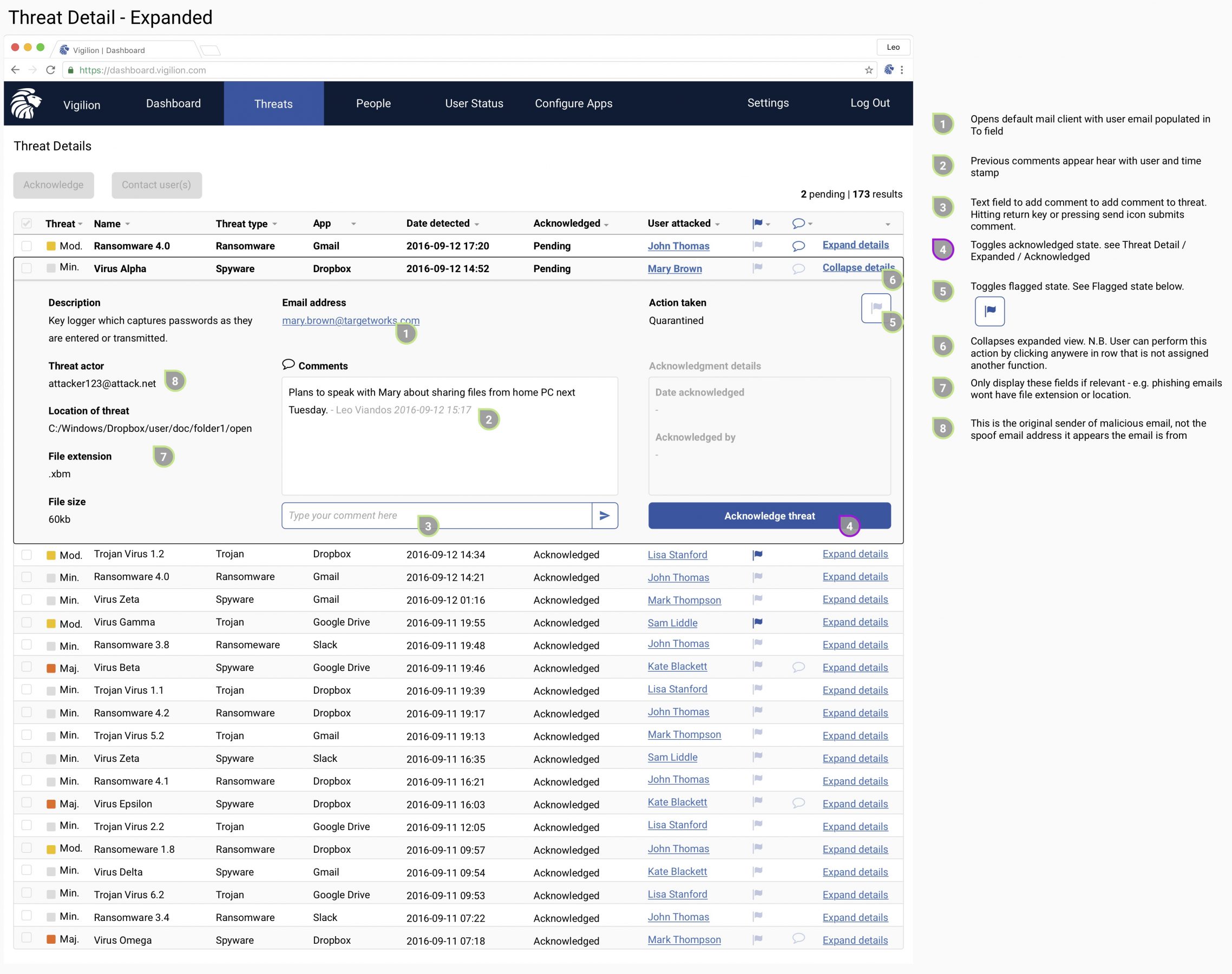
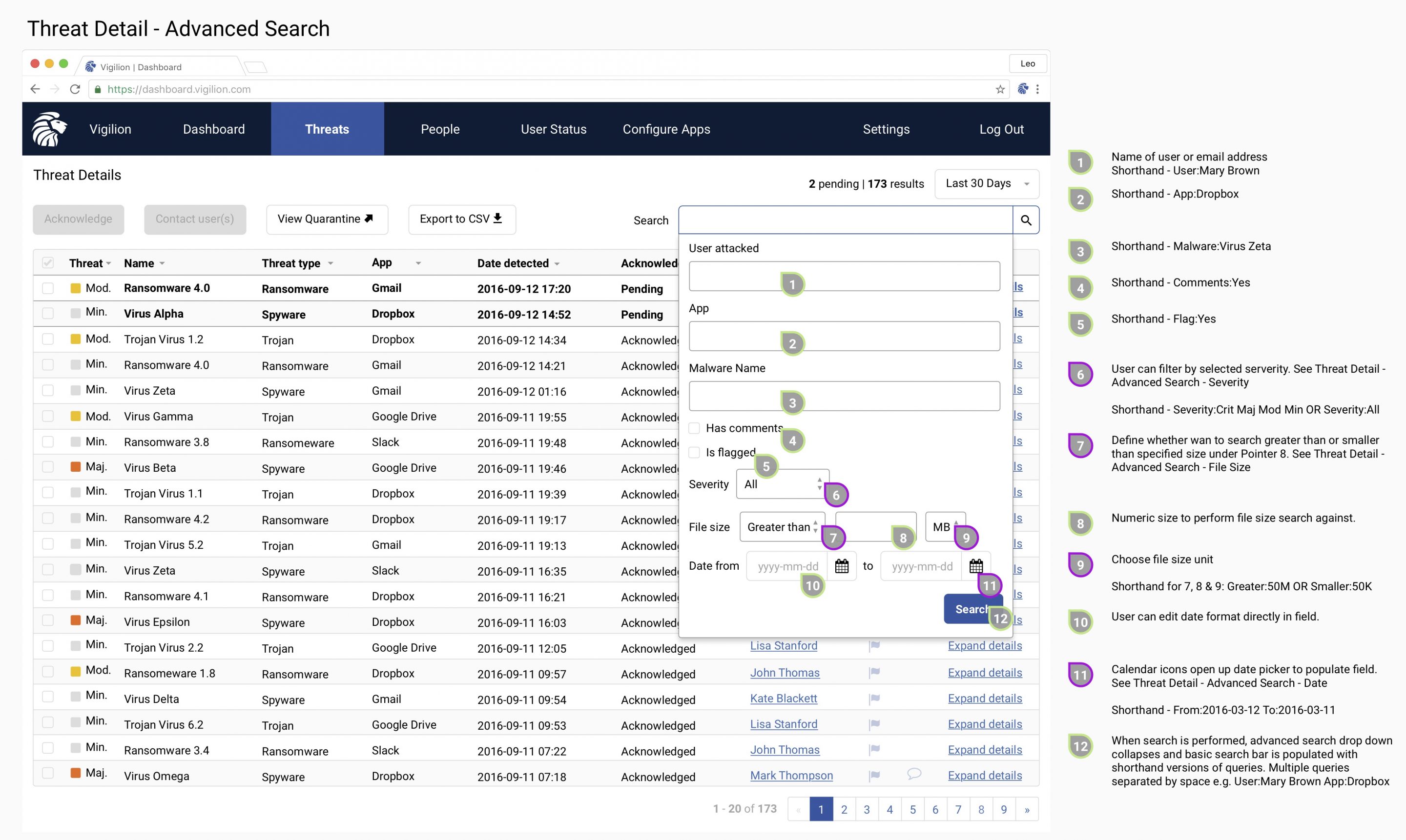
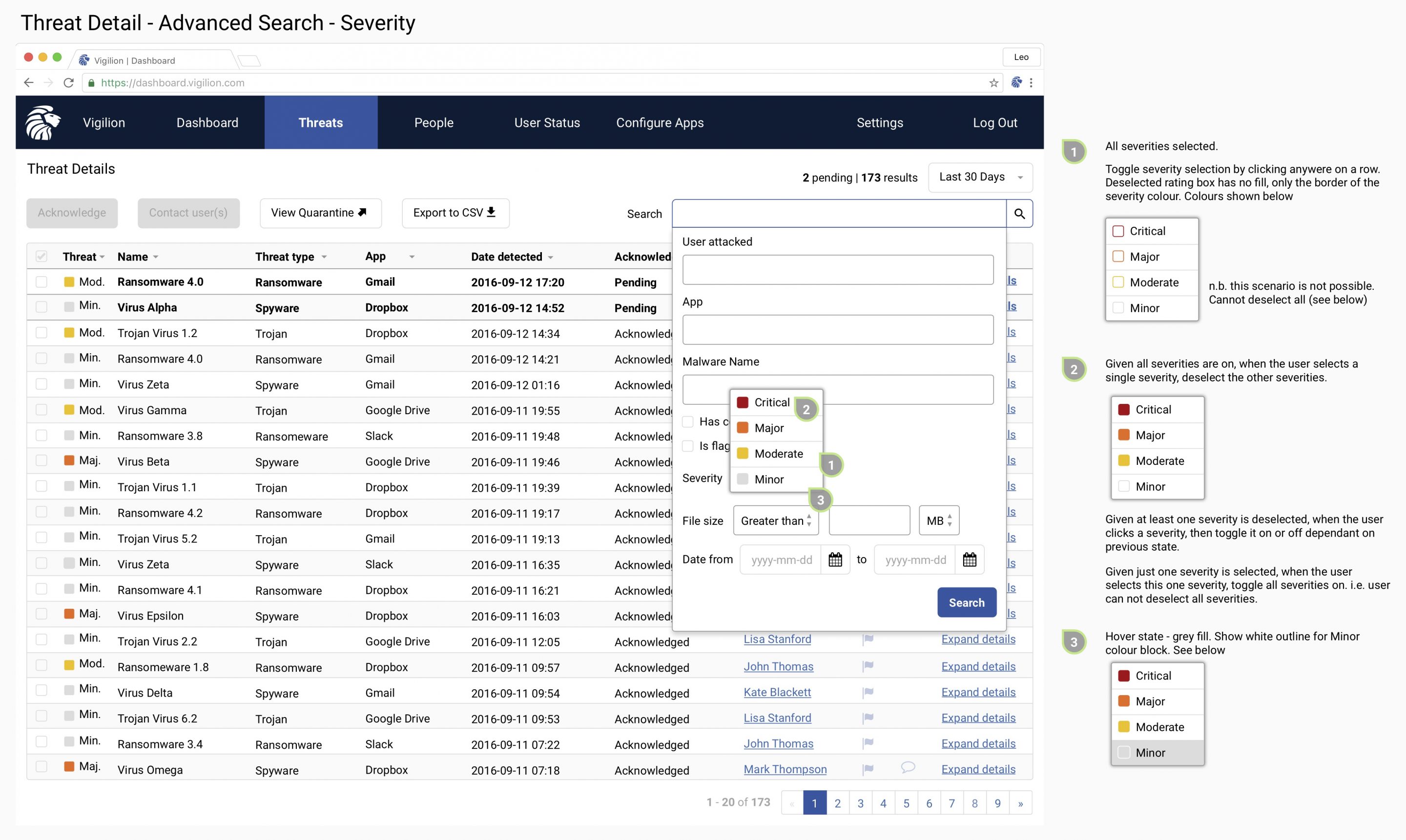
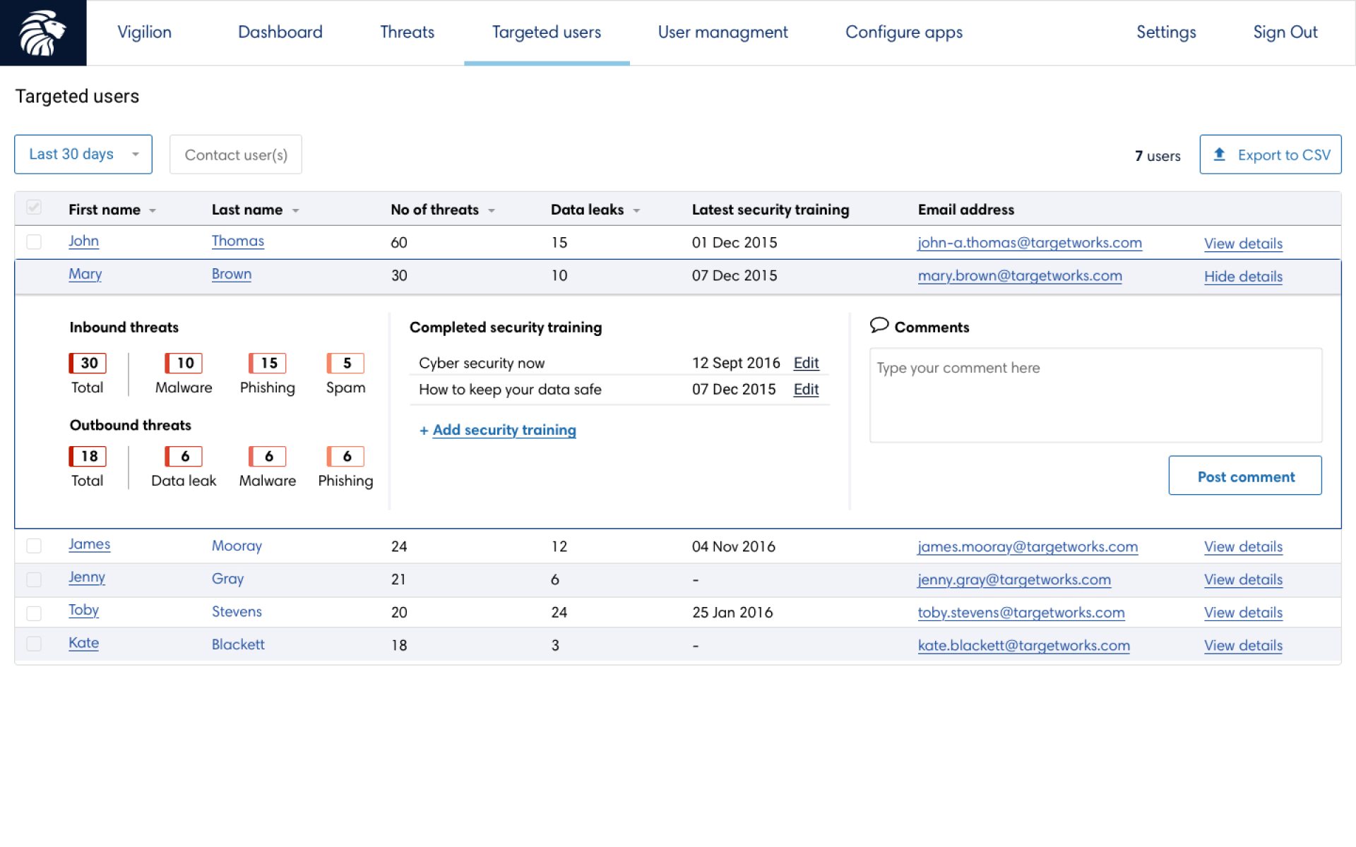
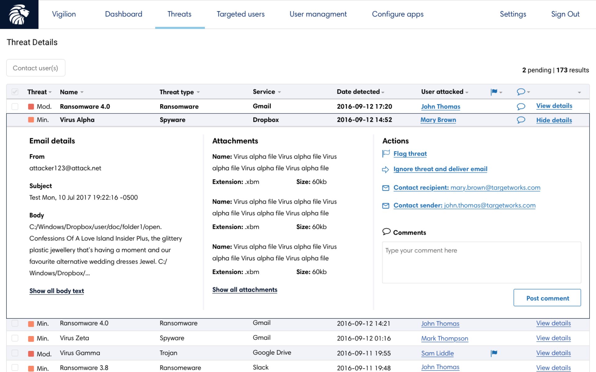
The outputs of the design sprint guided the first iteration of the product. I extended the designs to cover more data heavy pages, such as tables and threat information. I made use of expandable rows to support content layering for progressive disclosure.
The chosen brand colour was a deep blue to representing strength, integrity, and seriousness. I introduced accent colours of red, orange and sunglow yellow in the visualisations to create high impact designs and offer a severity scale for threats.
UI updates
As the product evolved, the look and feel was improved and some functionality was de-scoped for the first version. Real data showed that threats were being detected a lot more frequently than anticipated, so I updated the design of the timeline.
However, user testing revealed that few users intuitively understood the new split axis on the timeline, so I proposed solutions to make the data clearer. I measured the effectiveness of my design iterations by user testing each with a question test on UsabilityHub. I quadrupled the proportion of users that understood the visualisation and cut the time taken to interpret it by 20%. (Final iteration shown leftmost below)
Although still widely used, donuts have fallen out of favour with visualisation experts. This is because angles and area are hard to compare. Spatial location and length are preferred.
However, donuts are good for quickly recognising a single ratio or proportion when accuracy is not required. For example, we all know that 3, 6 and 9 o’clock represent 25%, 50% and 75% respectively.
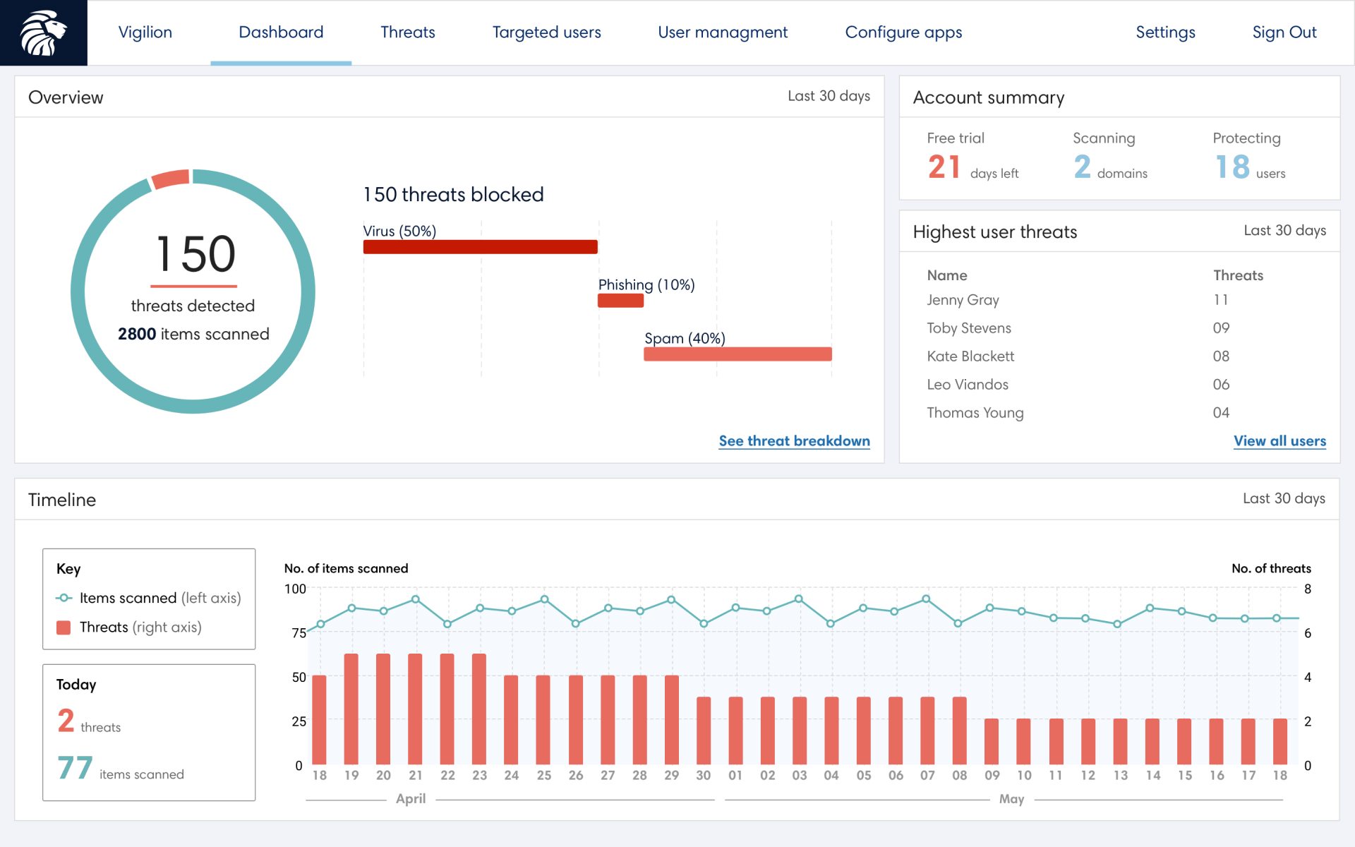
I changed the threat breakdown visualisation to a horizontal bar chart. I used a donut to represent the ratio of threats detected vs the total files scanned. The donut also provides visual weight to this section – designed to grab attention if the threat ratio became high.
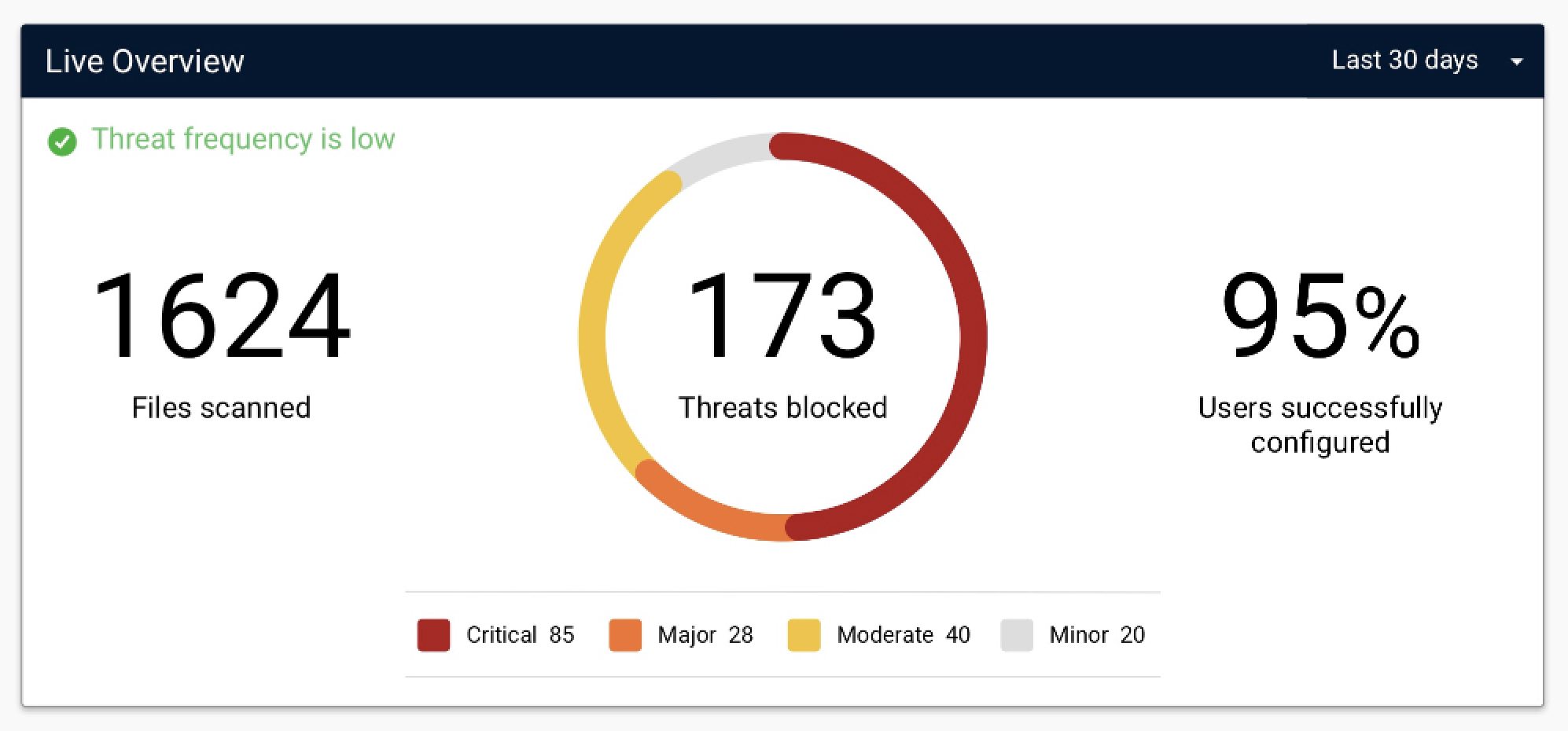
First iteration
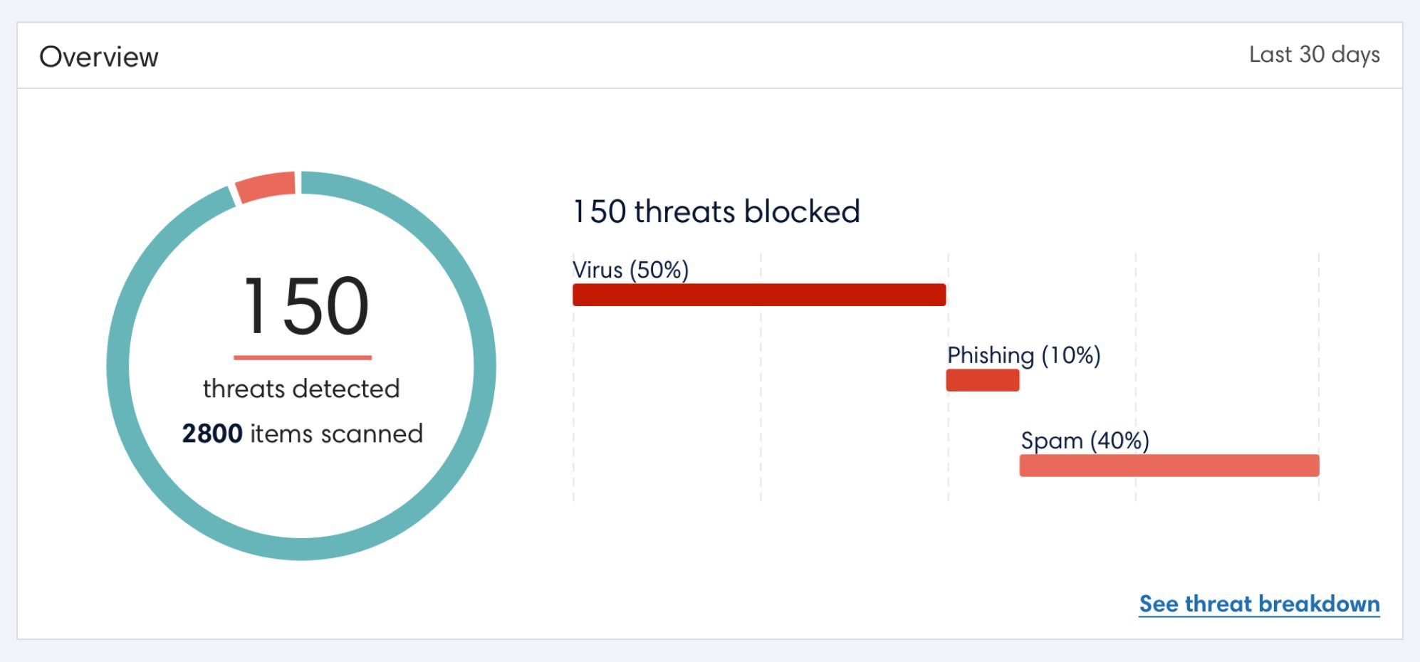
Redesign
Deliverables
SaaS Web App
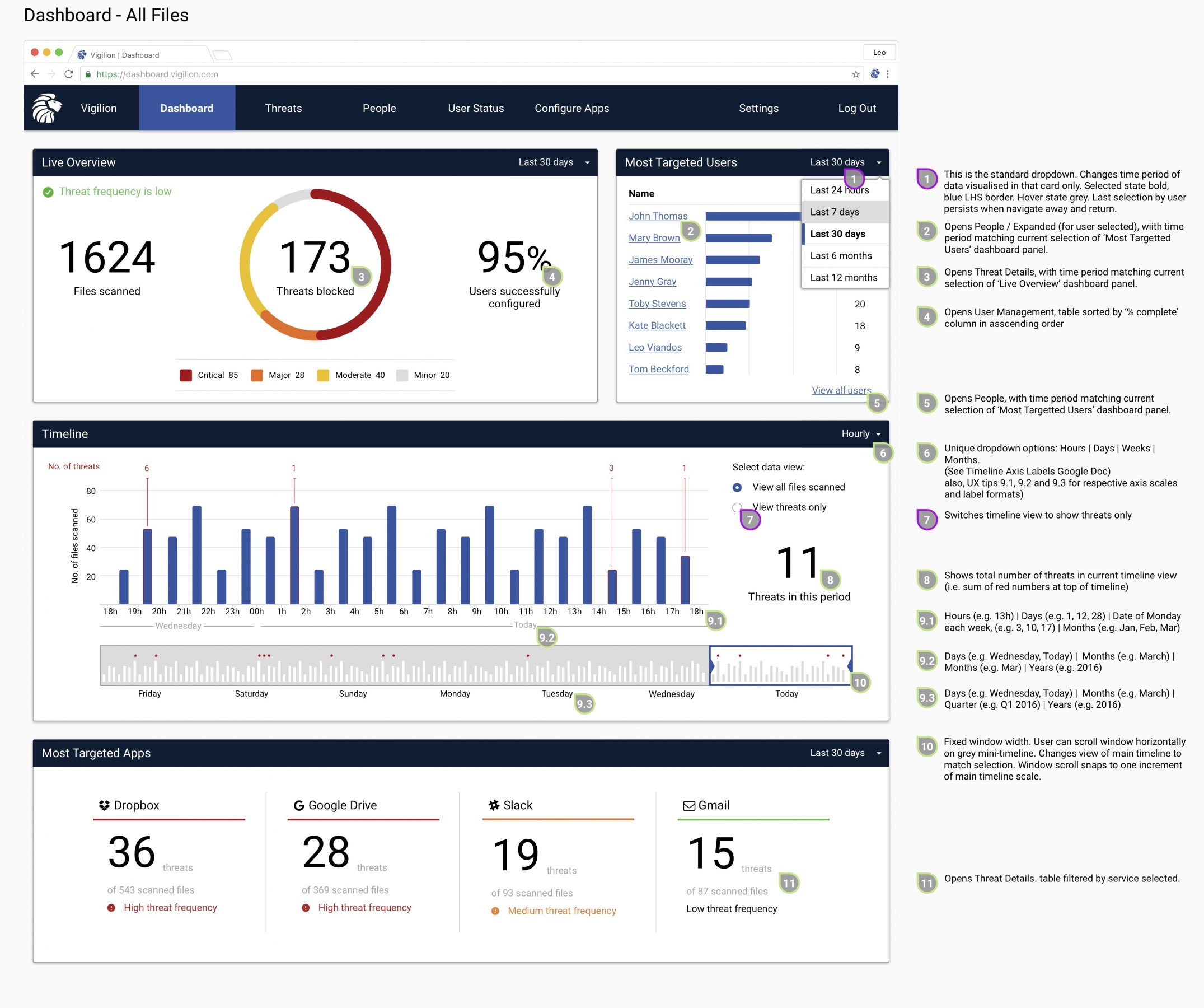
The dashboard was designed to give a high level overview of threats across an organisation. Furthermore, to help the IT security team identify at risk employees, it included a breakdown of the most targeted users. An interactive timeline also allowed users to see trends in threats over a chosen time period.
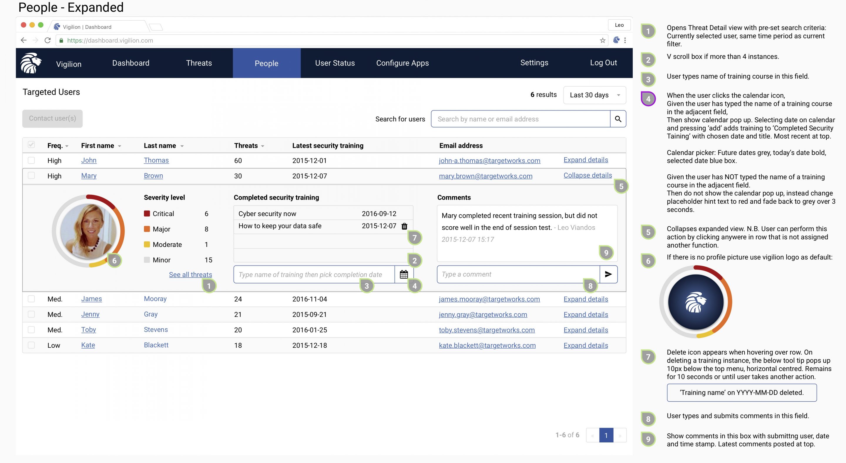
Other pages include details for individual threats and users. To mitigate user threats, IT teams can see the threat breakdown for users, add notes and mark which security training they have completed.
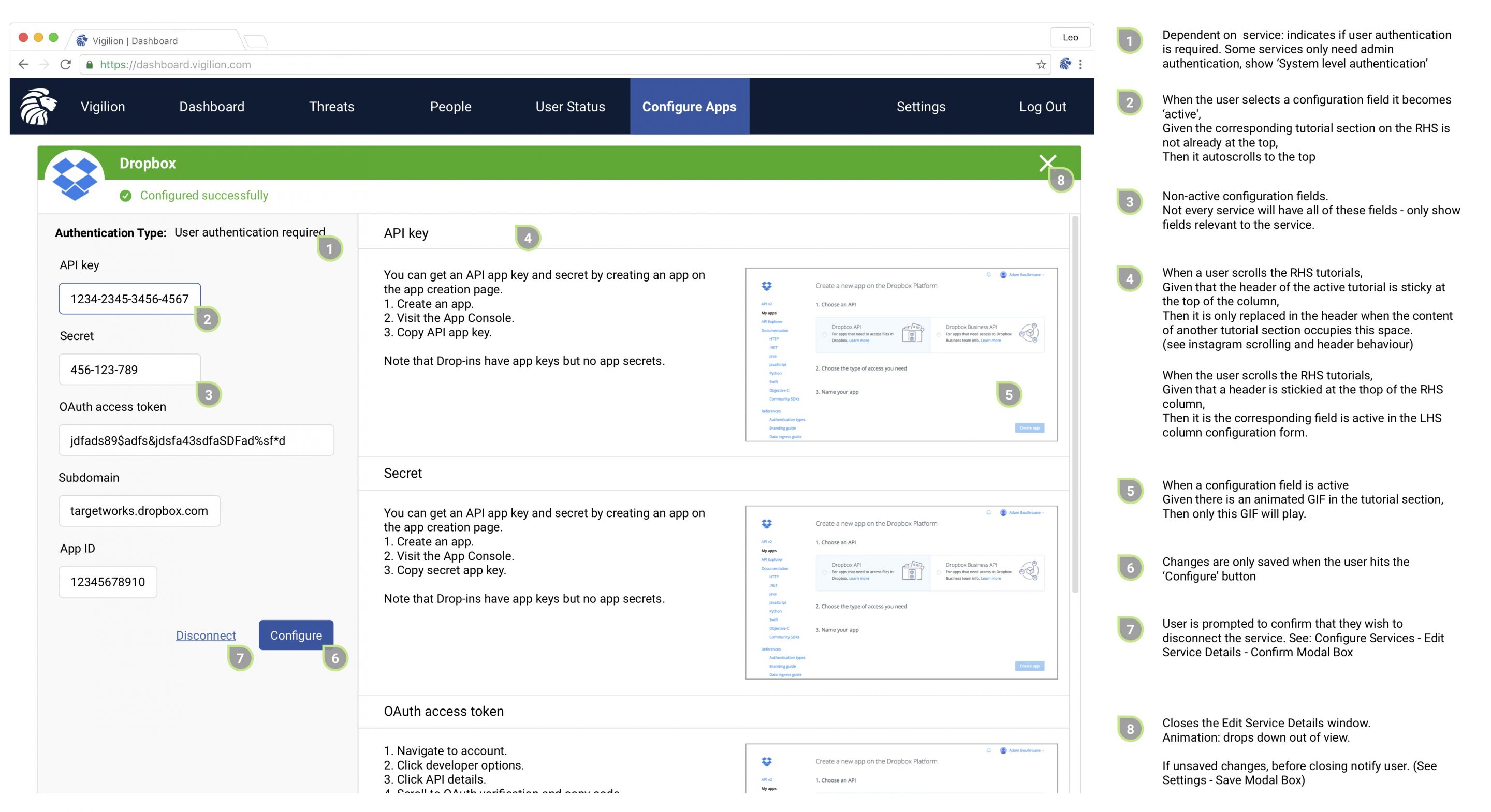
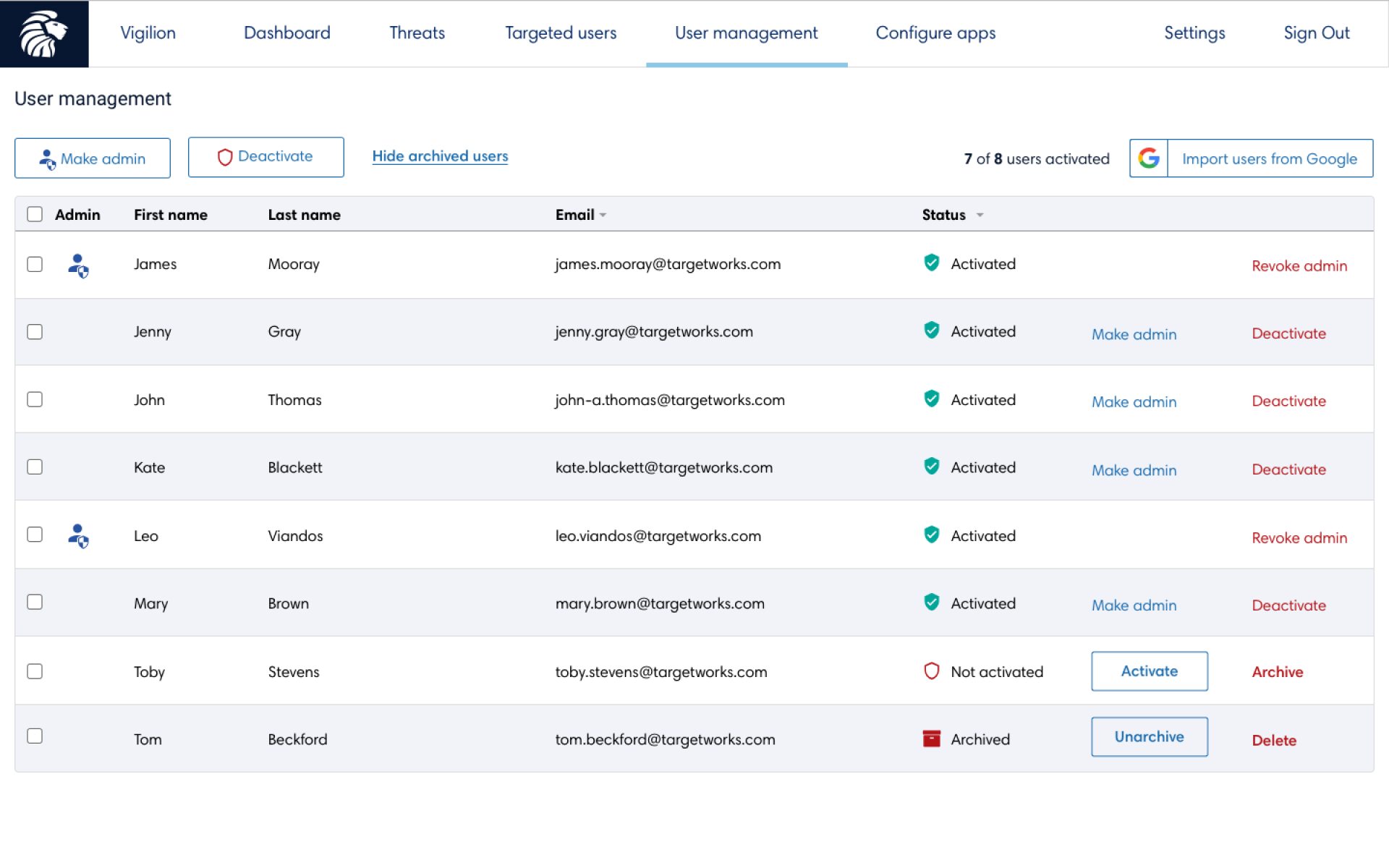
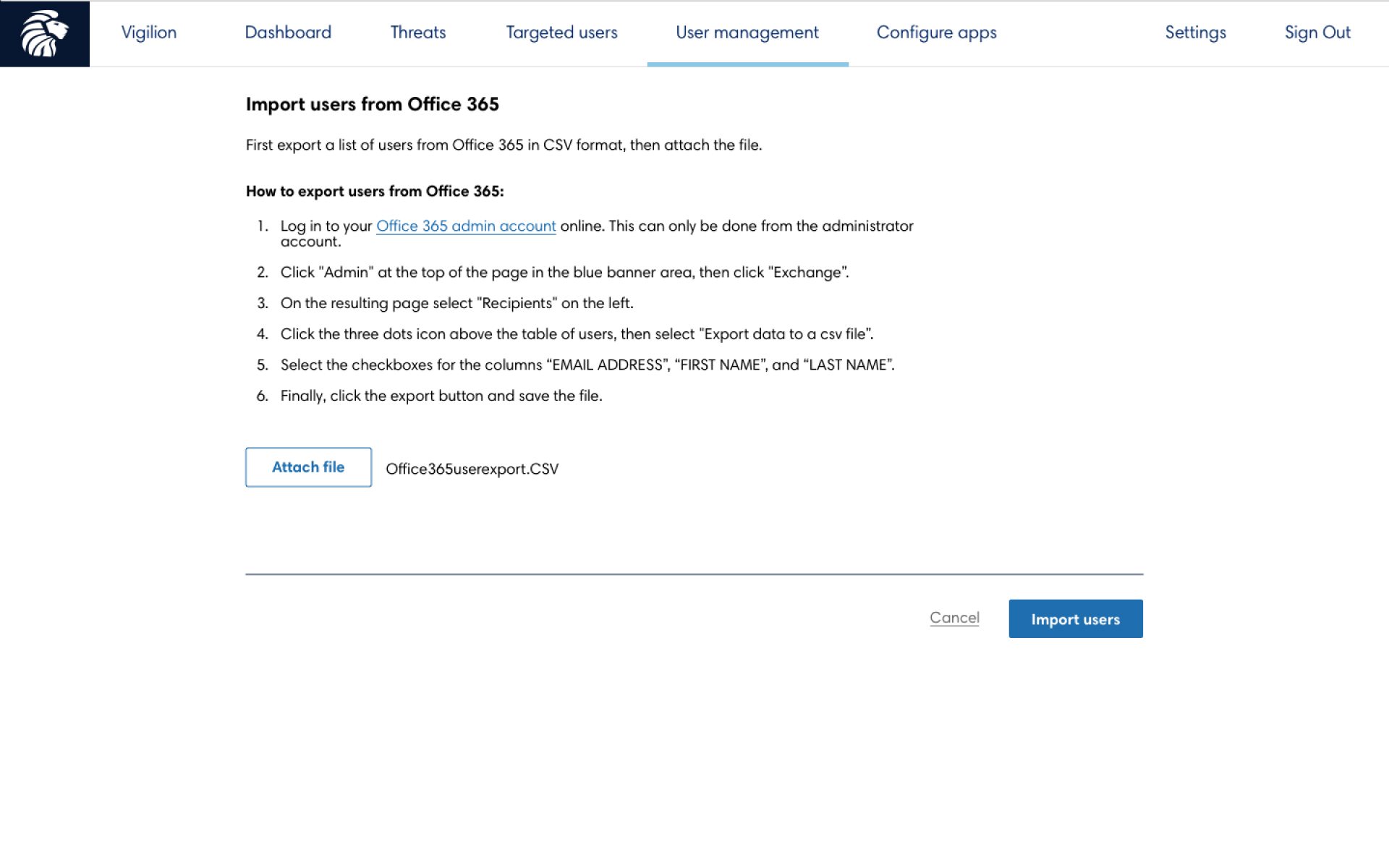
Beyond the data, admins need to be able to configure system settings and users. I designed the UX and UI for these pages to complete the SaaS product offering.
Secure messaging app
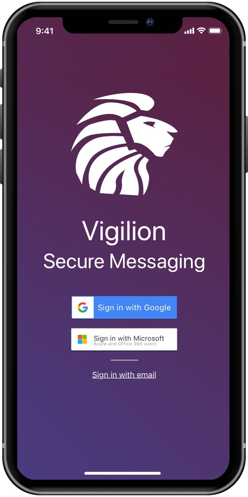
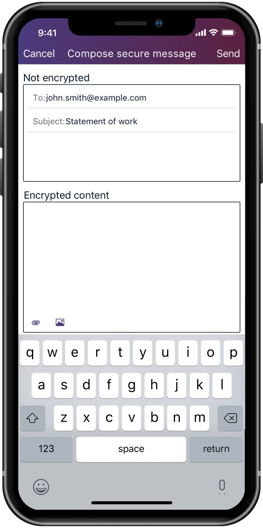
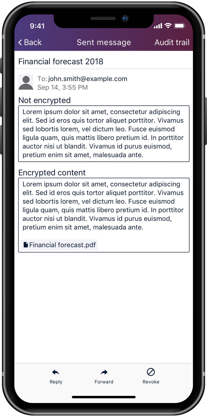
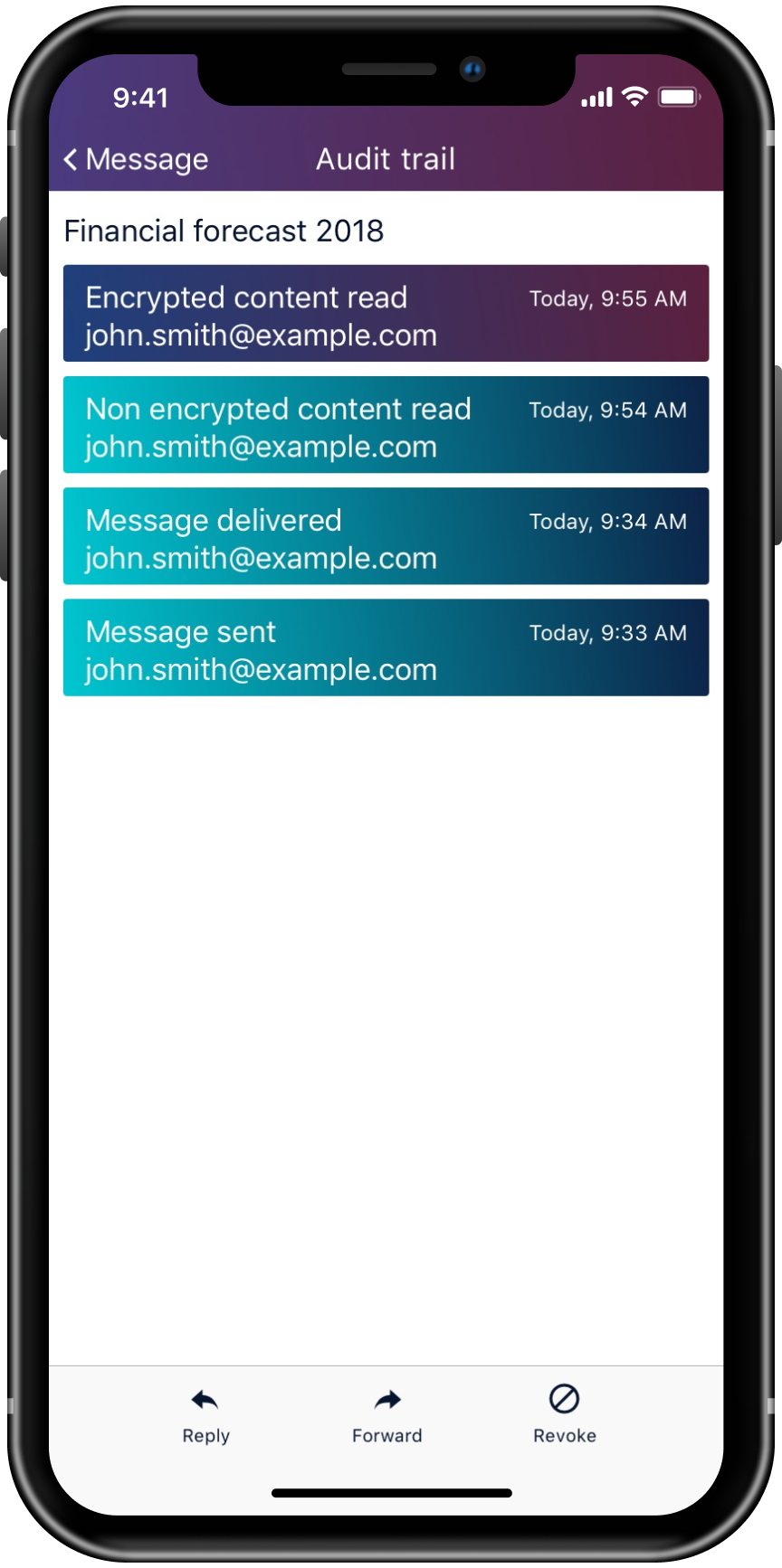
The secure messaging app is an extension of the Vigilion product offering. It will allow individuals to send encrypted messages and attachments. The app allows messages to be sent with a regular section and a secure section. I created the UI for the iOS app, designed in accordance with Apple Human Interface Guidelines, for iPhone X.
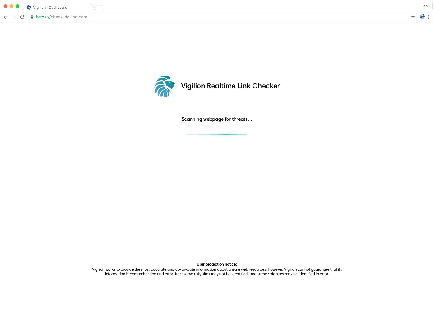
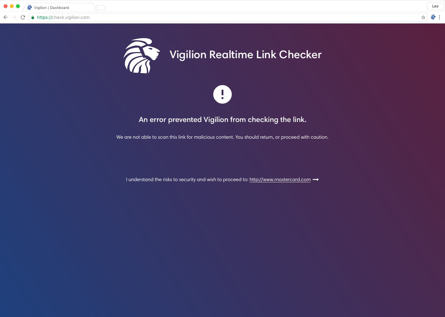
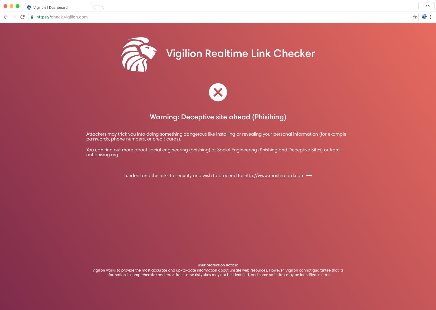
Realtime link checker
The realtime link checker scans a page when a user is directed to it from an email, then informs the user if the page is suspicious.
Responsive emails
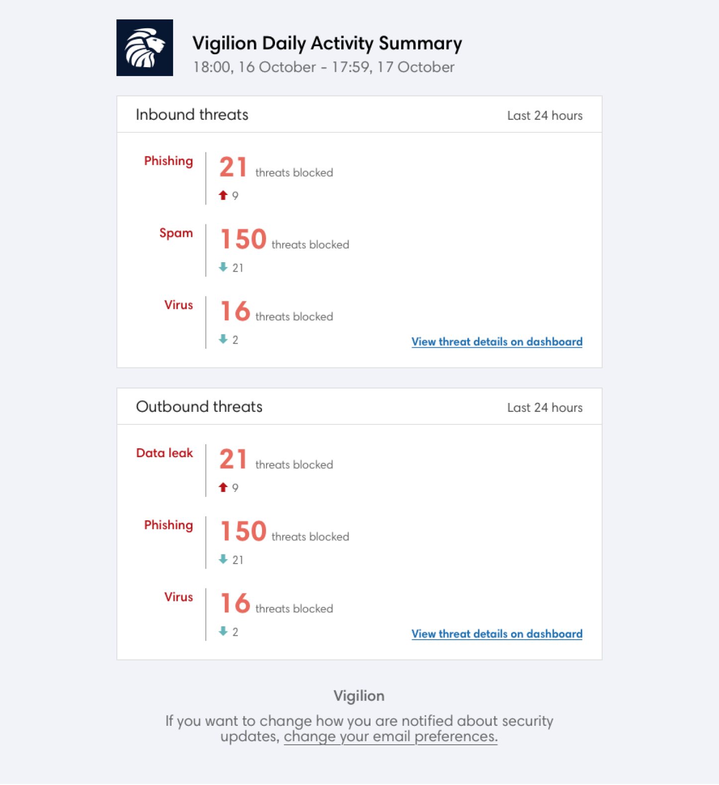
Email notifications for admins and users of the web app.
