Challenge
Demonstrate the potential of connected car capabilities.
Solution
Create a connected car app prototype.
Services
-
- Workshopping (support)
- Information architecture design
- Wireframing
- UX & UI design
- Interaction and animation design
- High fidelity prototype creation
Background
The connected car allows drivers to control and set up their vehicle from their phone. Suzuki wanted to improve their connected car offering to bring themselves inline with the market leaders. Suzuki listed the features that they were technically capable of integrating and hoped to showcase this functionality with an app prototype.
The project was completed alongside two other consultancies with specialisms in automotive technical and HMI (Human-Machine Interface) design.
Approach
Kickoff workshop
A stark difference about this workshop was that not all of the participants spoke English! We ran the workshop with a Japanese translator. Although we moved a little slower, it was an interesting challenge and we still got great participation.
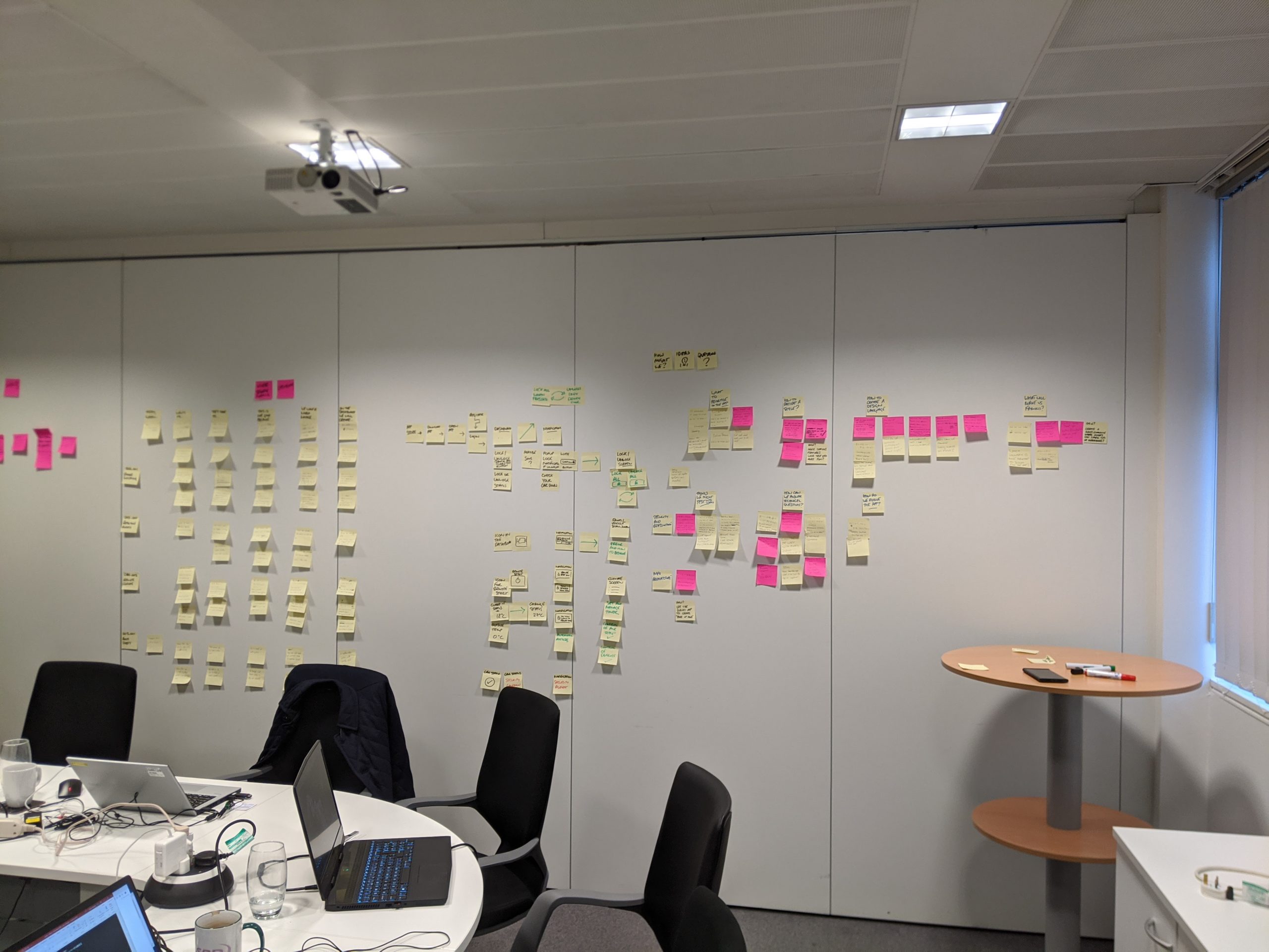
Is it even a workshop if you don’t end with a wall of post-its?
The client was new to app development, so we started by running through the design process. We reviewed competitor designs to give an idea of preferred direction and desirable features. The client provided a list of possible features and we prioritised them with dot voting. Ideally, we would have done some research ahead of the workshop to identify user needs, but unfortunately this was not in scope.
To round off the workshop, sketches of initial ideas were created to gauge direction and demonstrate design thinking.
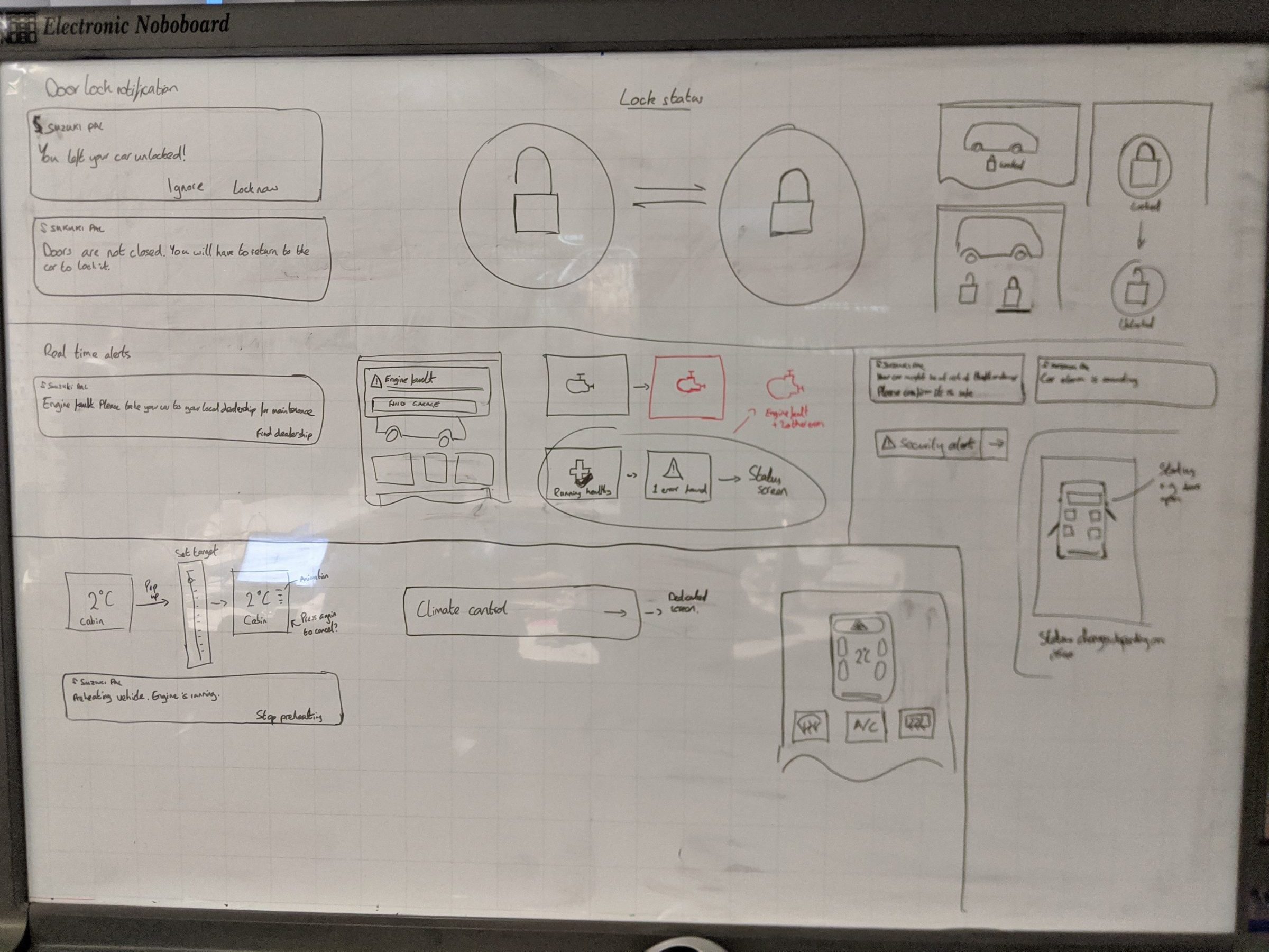
Sketching helped introduce the client to the design process
Establishing direction
Based on the exploration and some ideation, 3 ideas for initial direction were presented:
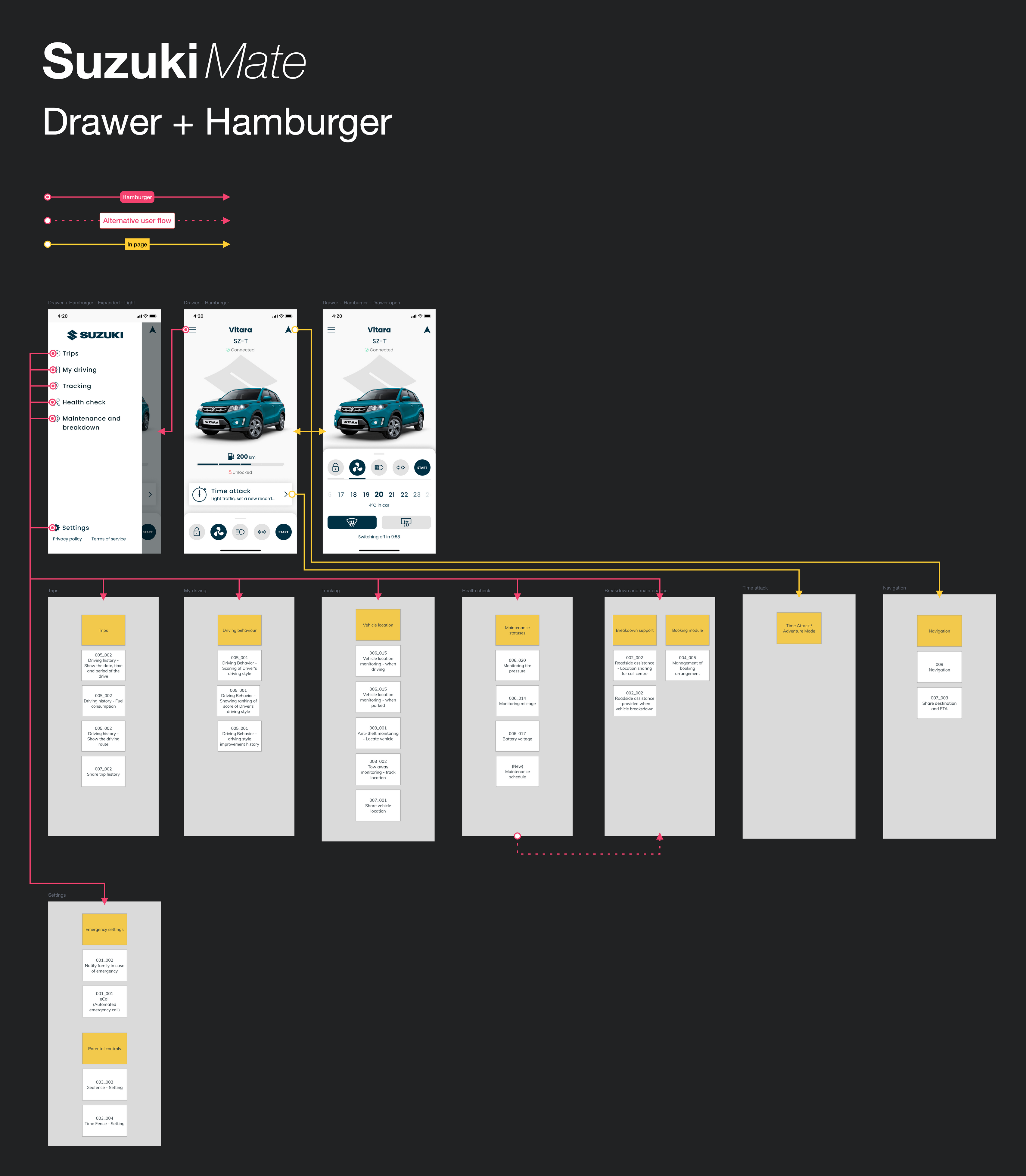
- Drawer + hamburger
- Drawer with everyday controls
- Extended functionality in hamburger menu
- In-page controls
- Home screen with everyday controls
- Tab bar
- Drawer + in-page nav
- Drawer with everyday controls
- Easy in-page navigation
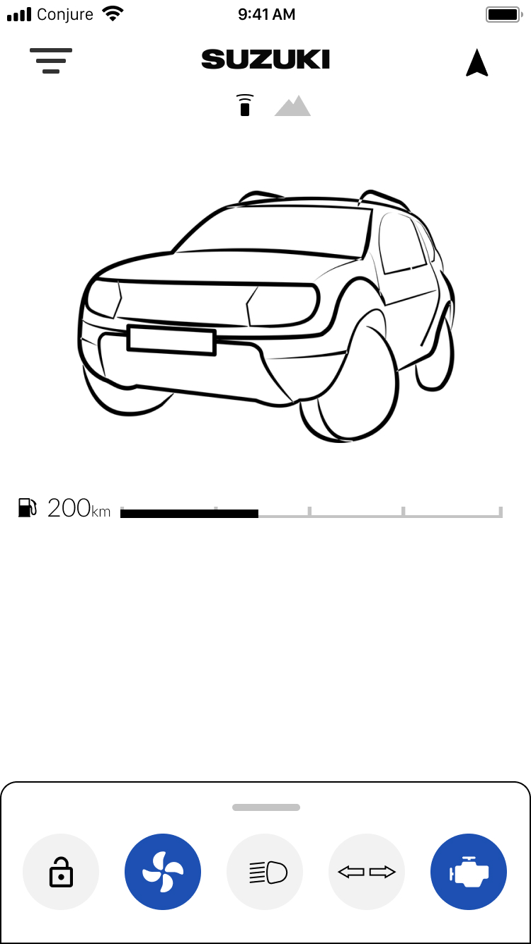
Drawer + Hamburger
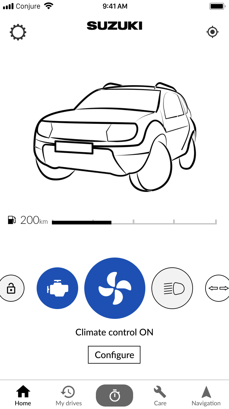
In-page controls
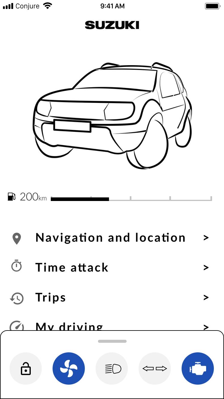
Drawer + in-page nav
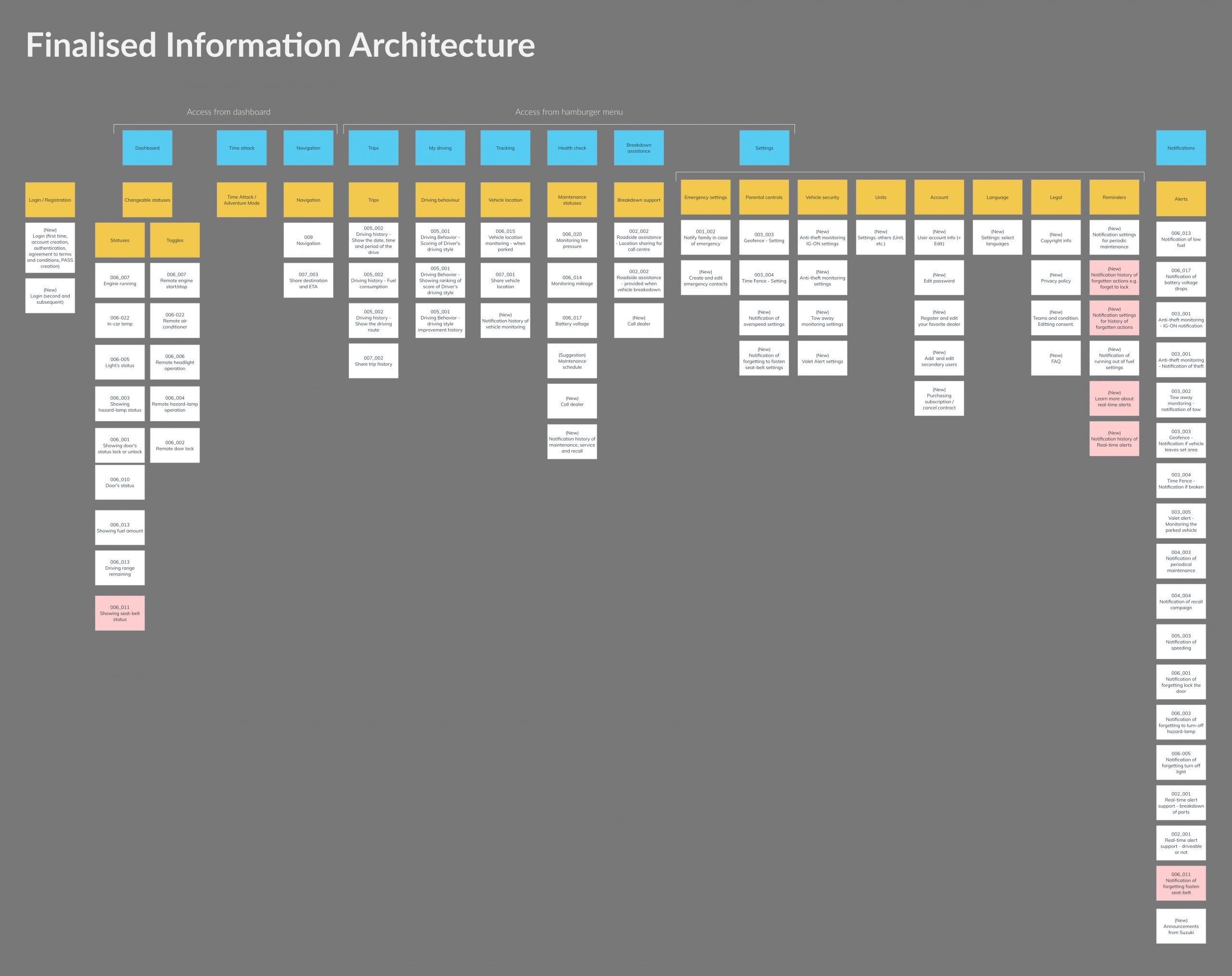
The merits of each option depended largely on the content. To explore how the content might fit in each option, a card sort was used. The information architecture for each option based on a full future feature list was presented.
Based on UX suggestions and client feedback, we agreed that the “Drawer + hamburger” idea was the best option. The main reasons being:
- Many features would be required infrequently. Rather than clutter commonly used areas of the UI, we preferred to put them in the hamburger menu.
- The drawer enabled convenient access to commonly used controls and its expandability meant advanced functionality could be hidden but with convenient access.
- The use of the drawer is unique from the competition and had potential to be a defining and recognisable feature.
Feature wireframing
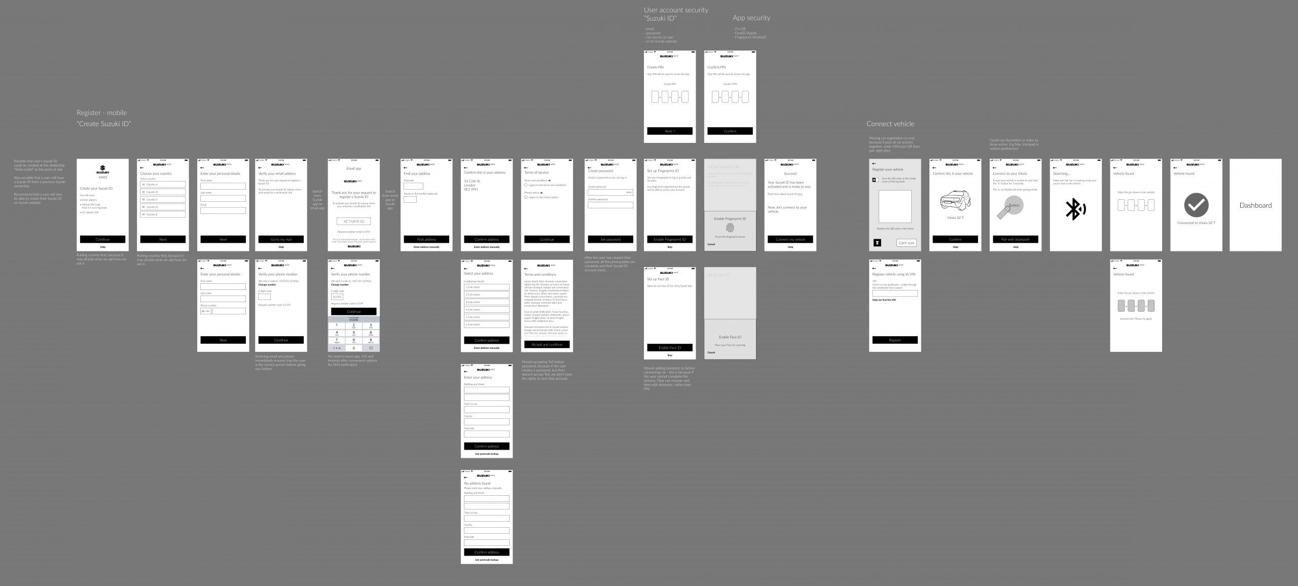
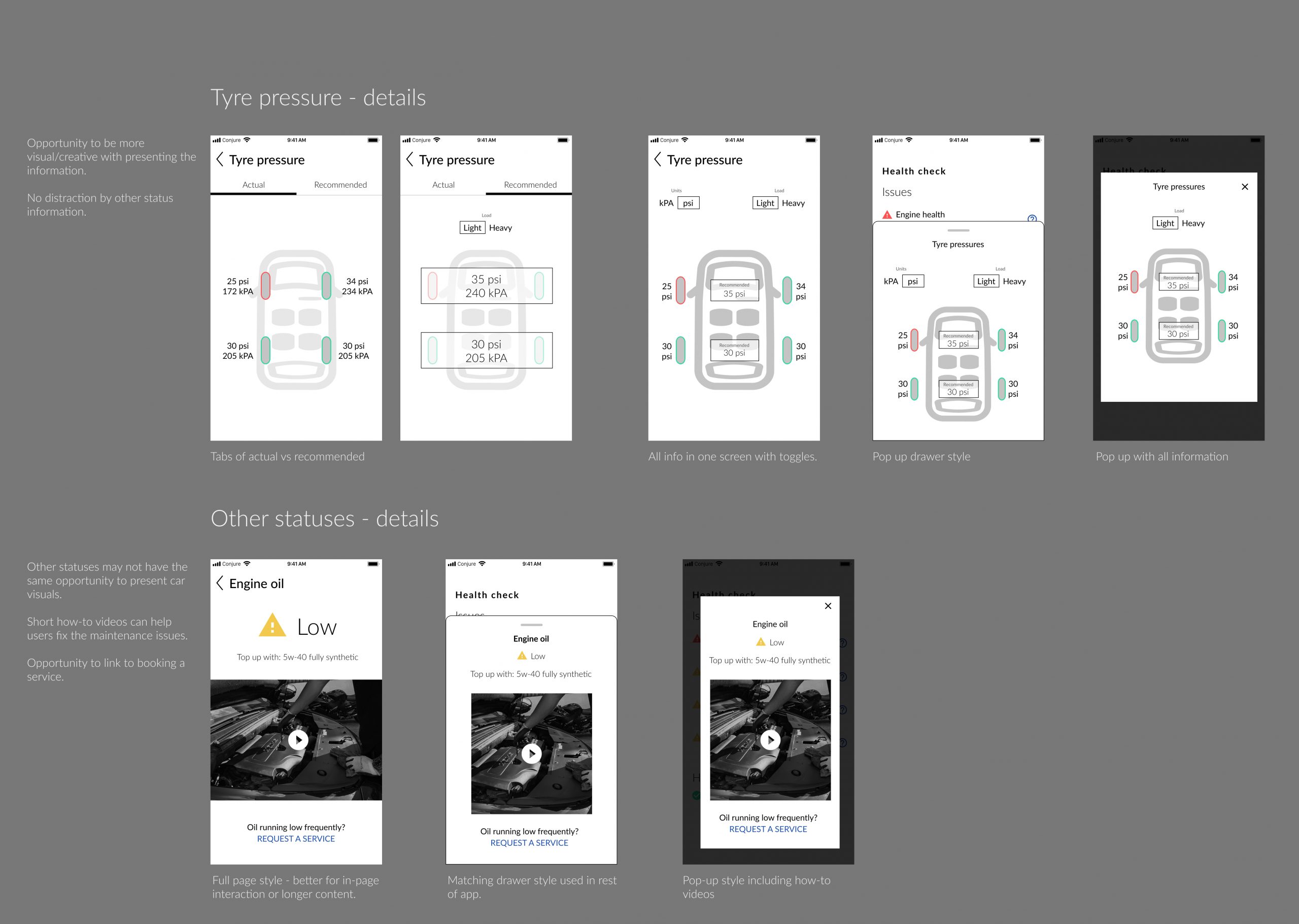
The priority features established in the workshop were further developed in the wireframing stage. Several layouts or options were designed for each feature and reviewed with the client. Features included: onboarding, remote control, health check alerts, security alerts, maintenance, and roadside assistance.
Deliverables
Information architecture
The full information architecture of priority and future features was diagrammed using Overflow.
Interactive prototype
The prototype was designed and built in Figma. All features were demonstrable in a single interactive prototype with animations and interactions.
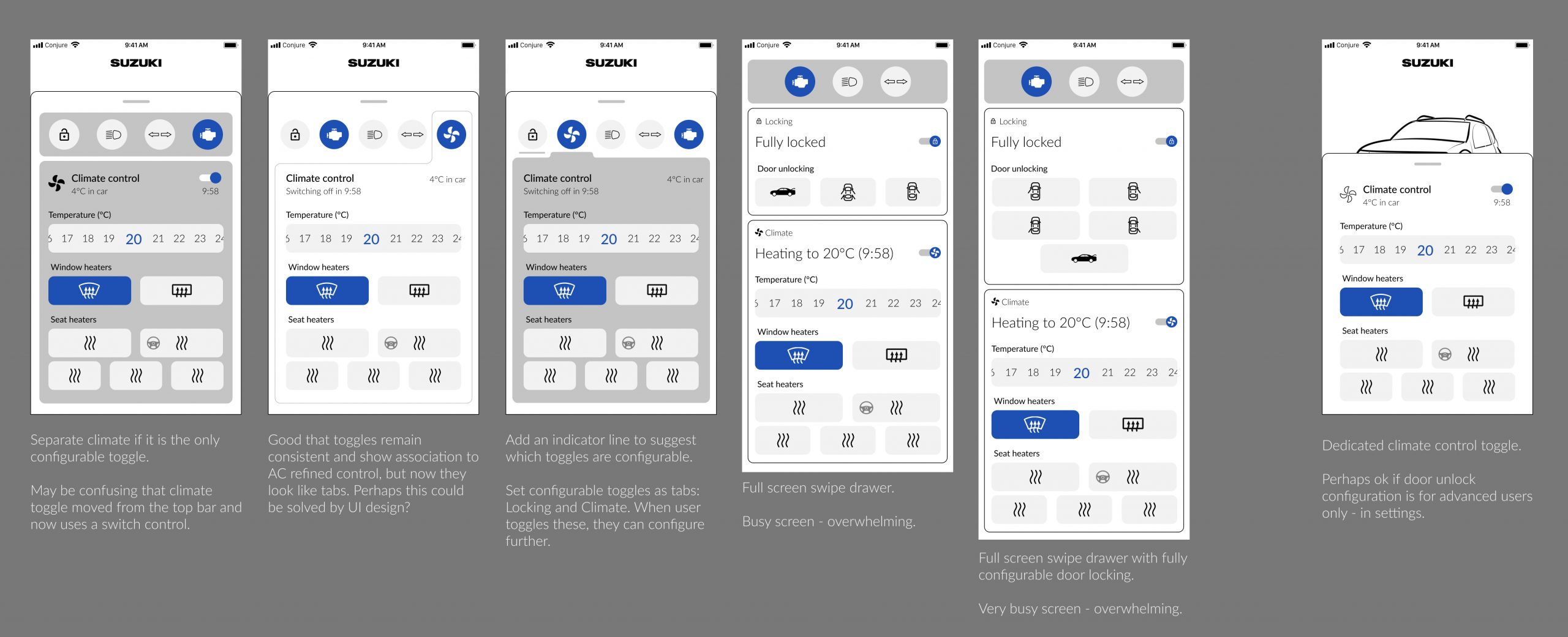
Remote controls drawer
- User can quickly toggle on/off
- User can access advanced controls by swiping up the drawer
- Advantage of this is that it’s easy to access and communicate the status of each
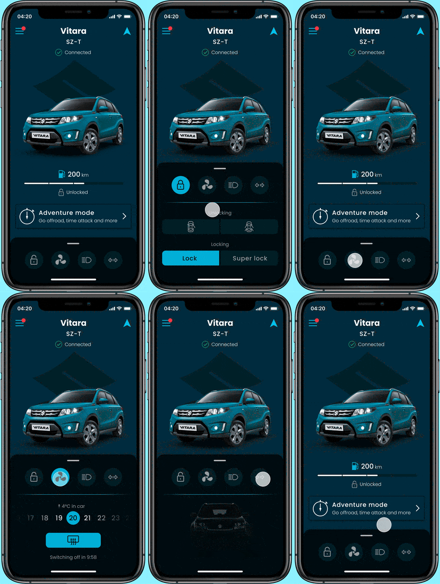
Drawer interactions
Breakdown assistance
- Simple demonstration for proof of concept
- Full UX dependent on service integration
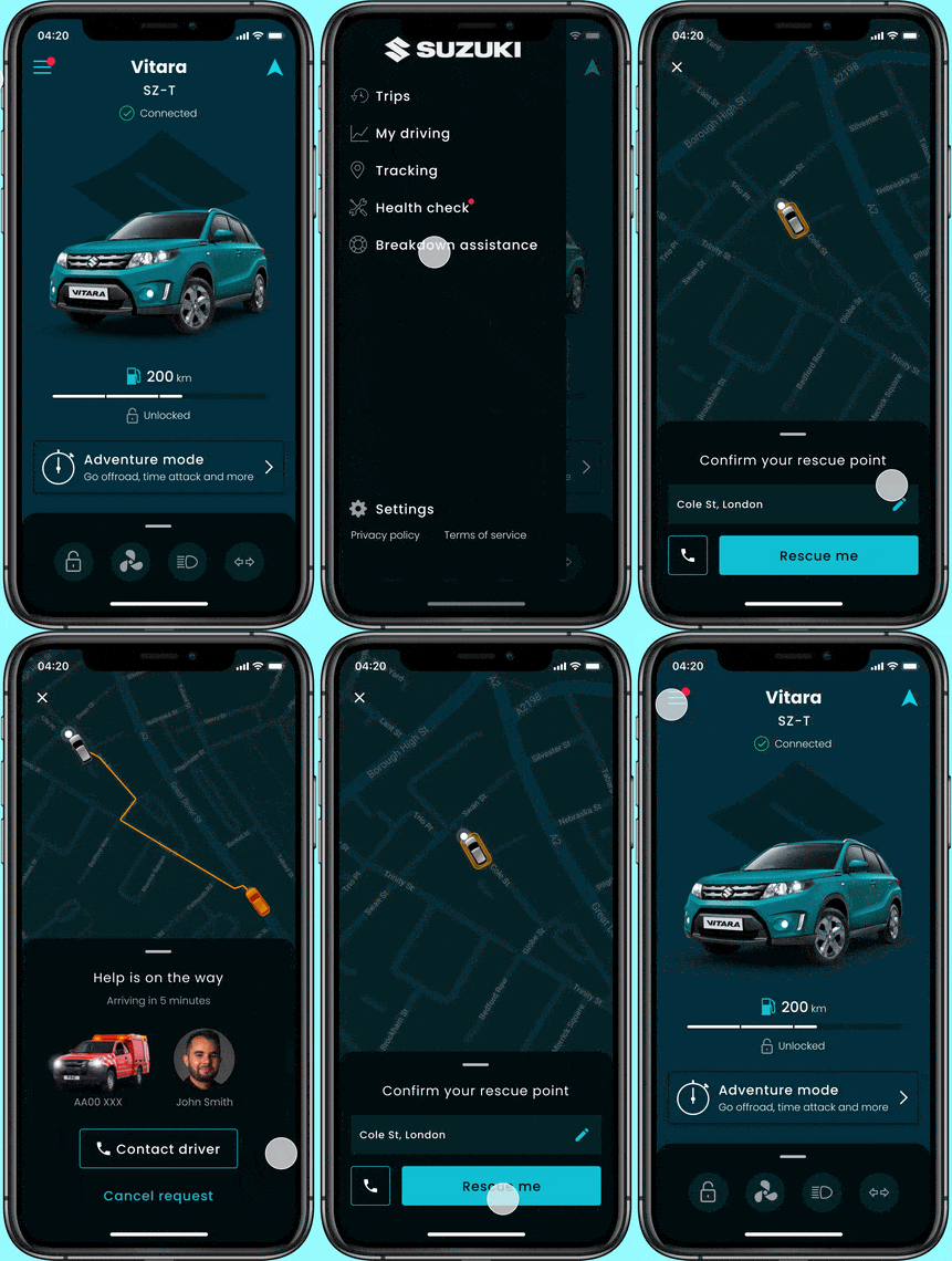
Requesting breakdown assistance
Tracking
- Tracking could be performed at any time, but was considered most useful as combined with security alerts
- The real-life scenario of this feature needs to be carefully considered. We wouldn’t want a user to put themselves in danger, so a warning message was included
Security notification and tracking
Health check
- General maintenance check information
- Vehicle health alert notifications
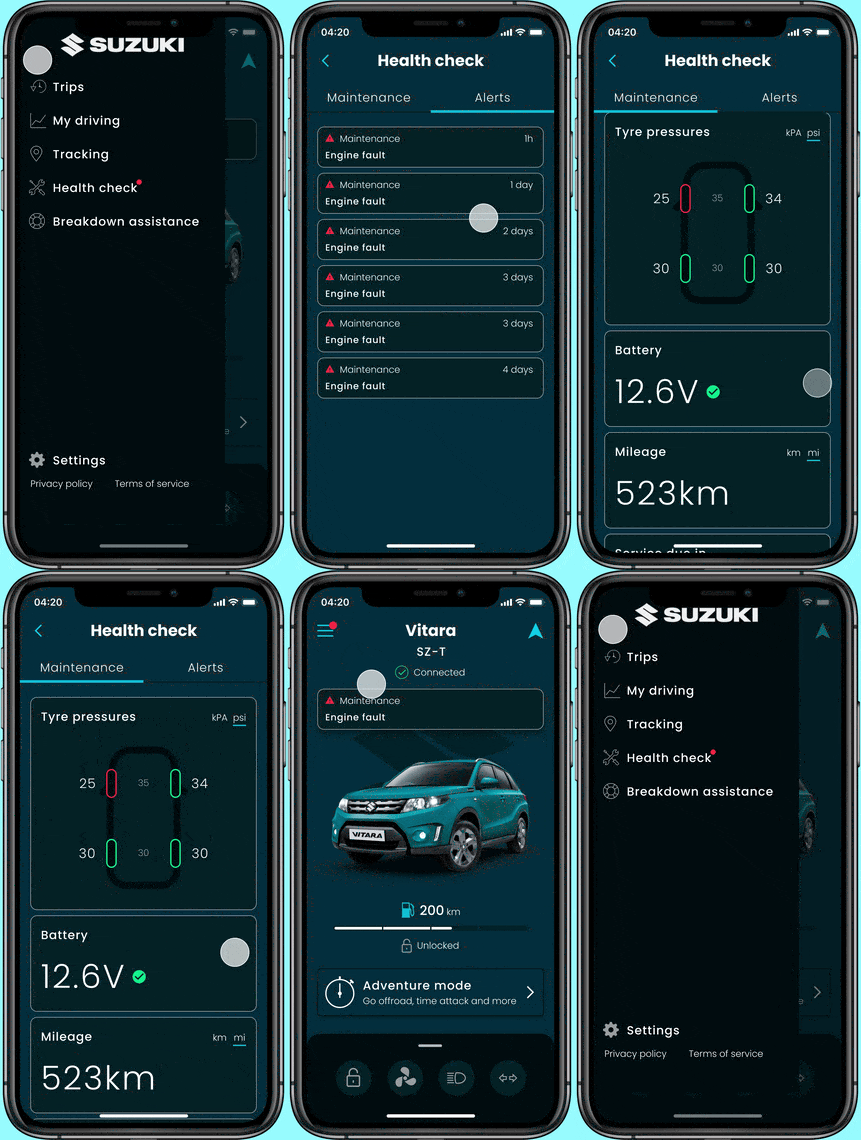
Vehicle health and maintenance
Style variations
Slight variations on styling demonstrated how the UI could be adapted depending on the final brand palette.
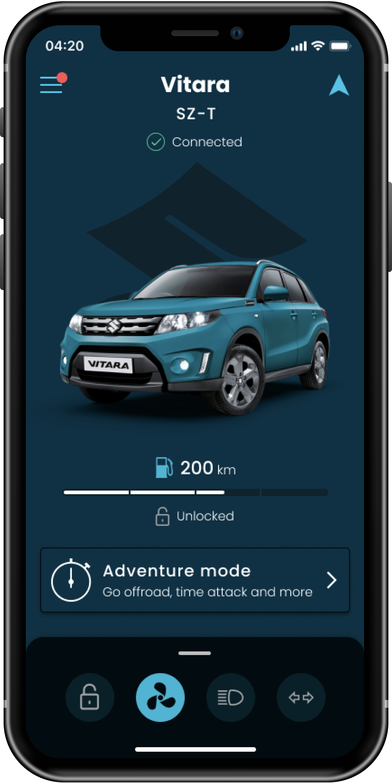
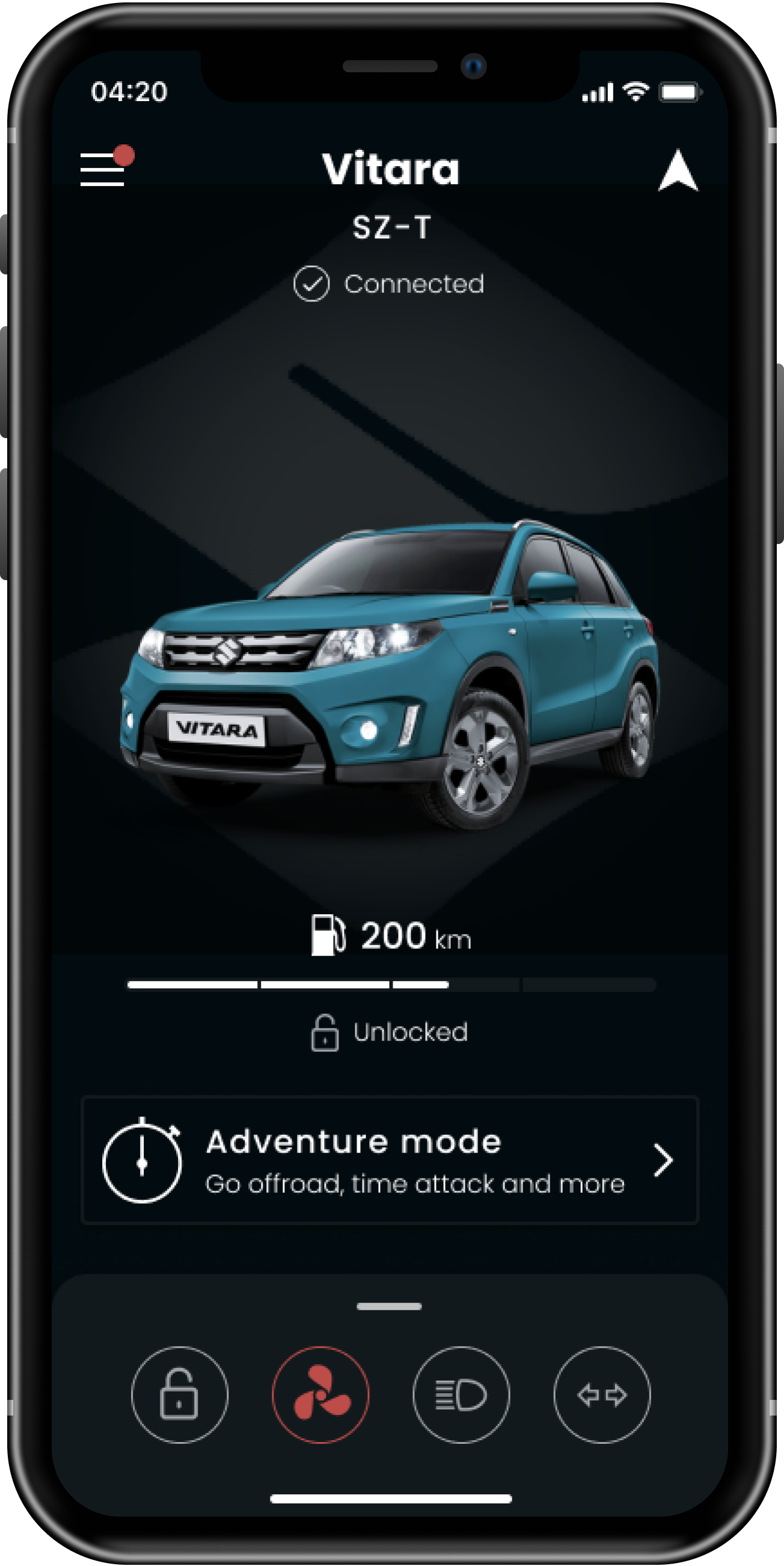
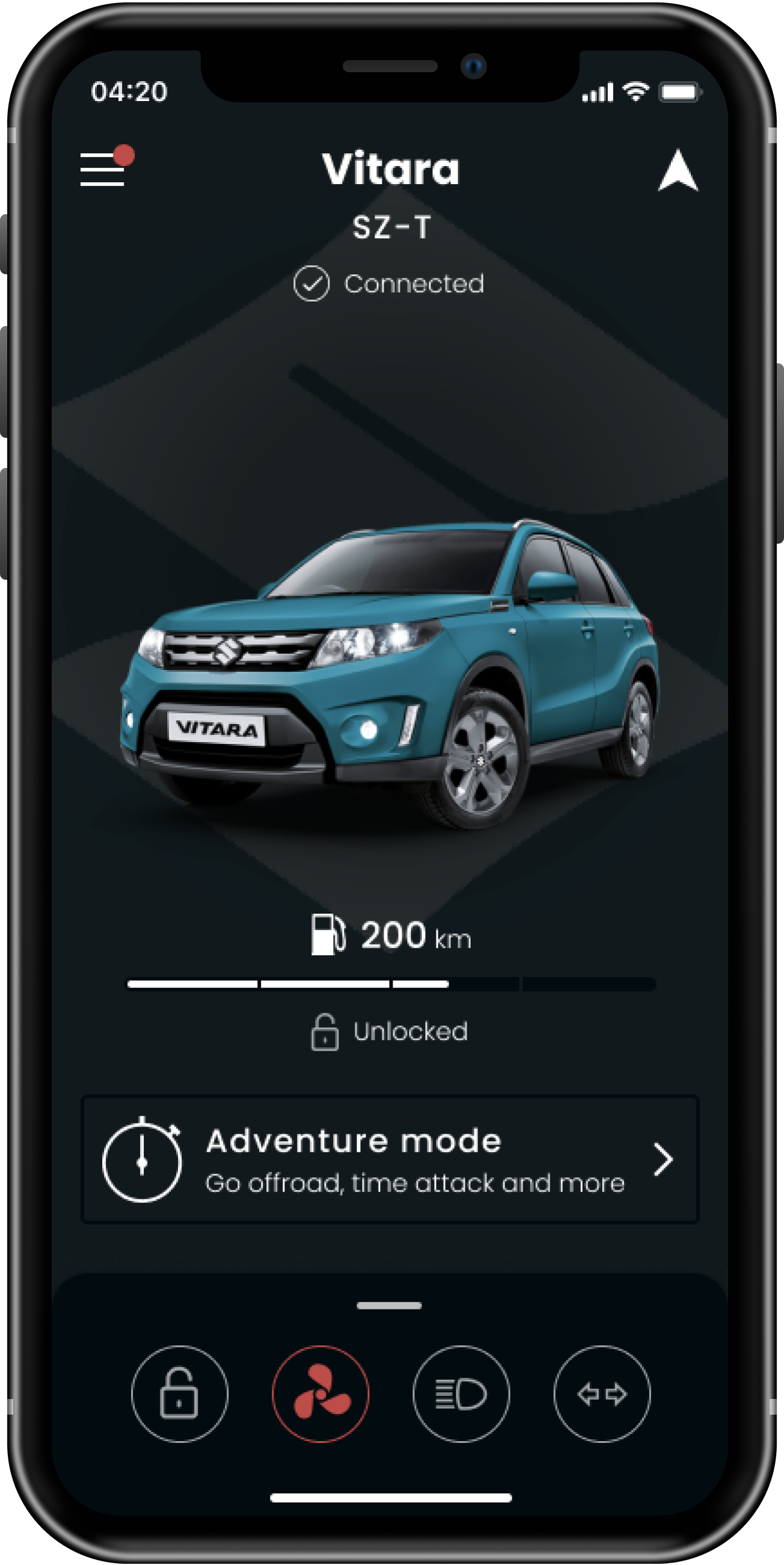
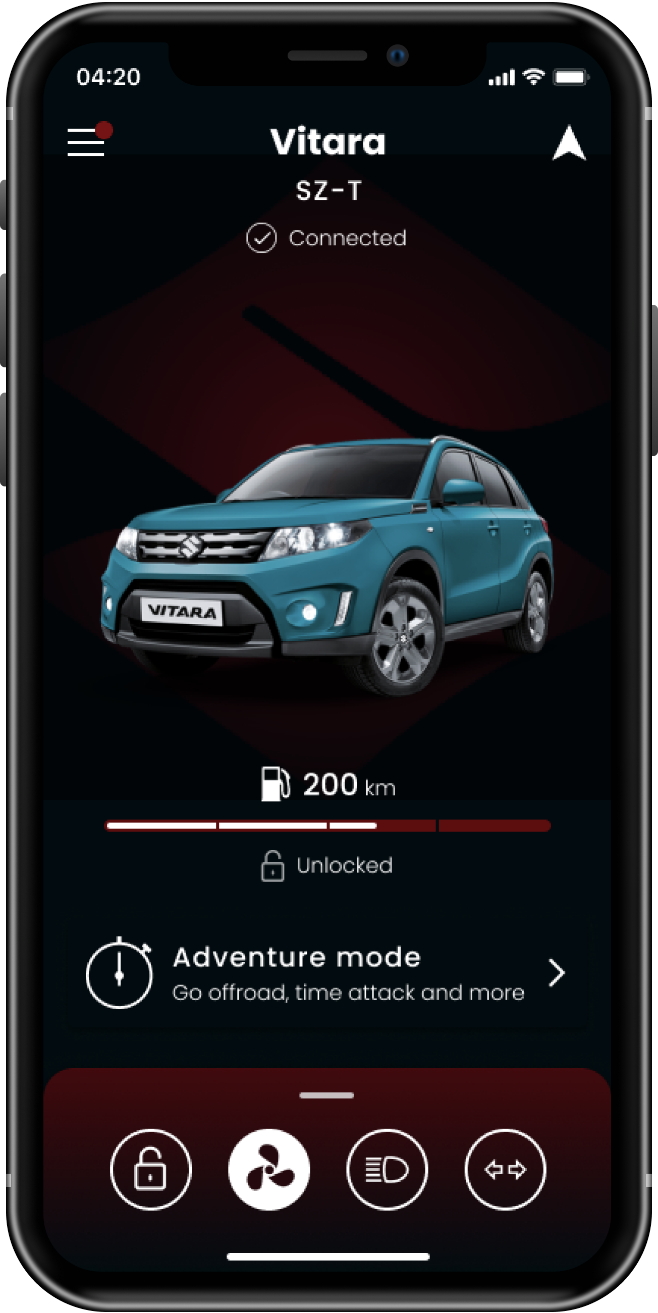
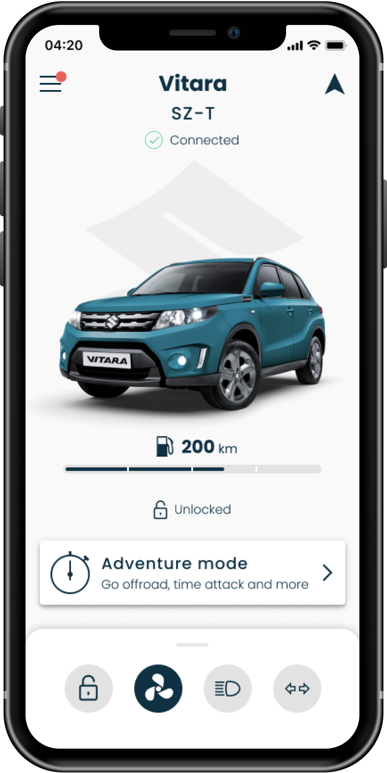
UI styling options
The client was very happy with the prototype and the other agencies working on the project were impressed with the quality and volume of output delivered over a short period of time.
The Suzuki client said:


