Challenge
Improve existing prototype designs based on user testing feedback collected.
Solution
User testing analysis and redesign of mobile-first web app.
Services
- User testing analysis
- Information architecture design
- UX design
- UI design
Background
Plan International (Plan) is a charity that provides support for vulnerable children and campaigns for children’s rights. Individuals can sponsor a child with Plan. Plan wanted to ensure sponsors continued to offer financial support by keeping them engaged. This would be achieved by helping sponsors to learn about the child, their culture and get more involved.
The aims of the project had already been determined by a discovery phase. A Marvel prototype had been designed and user tested. I was brought in as Lead UX consultant to analyse the user testing feedback and make improvements to the prototype.
Approach
Analysis of raw user test data
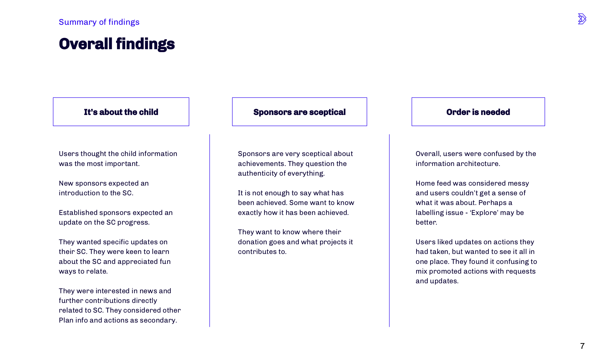
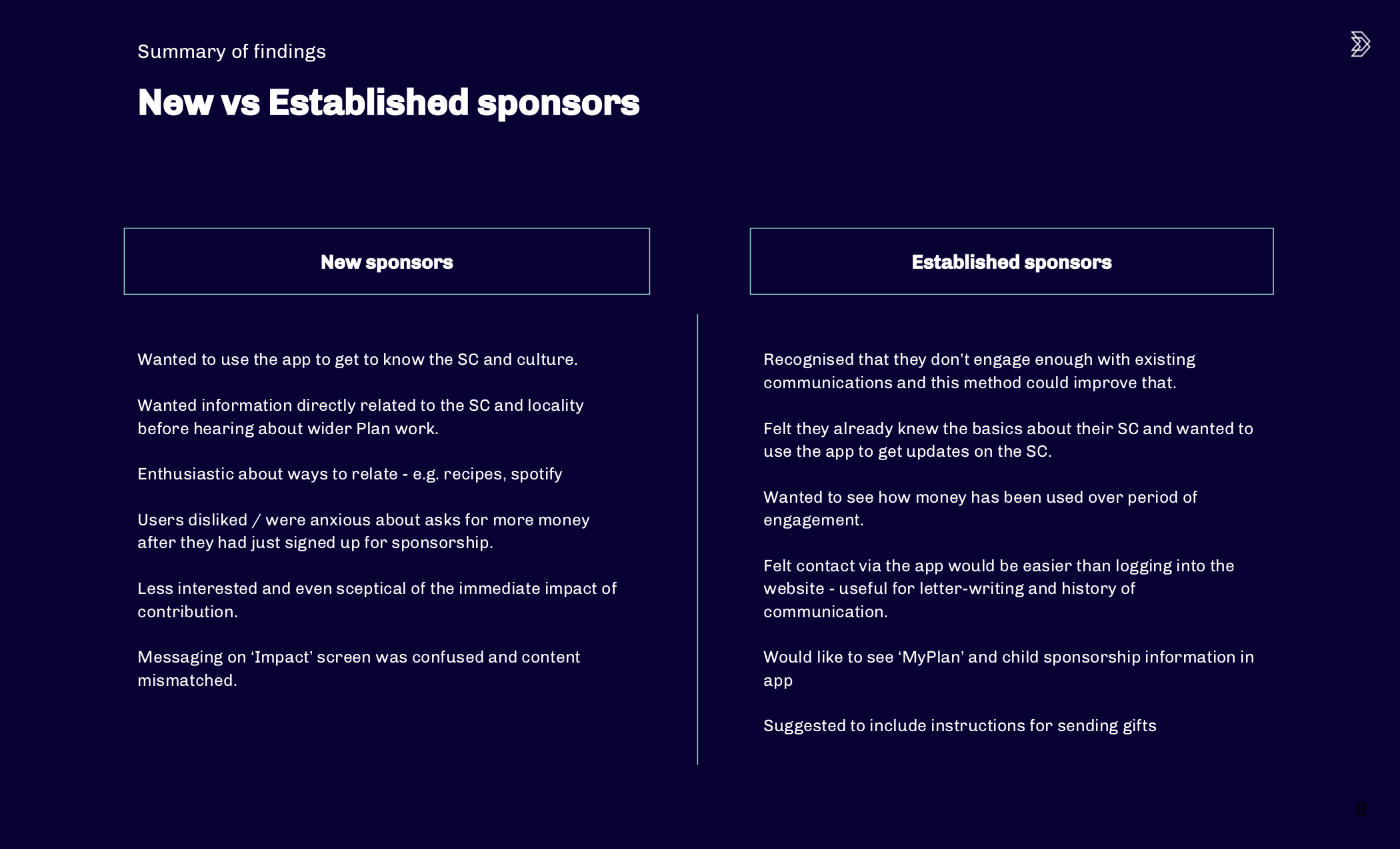
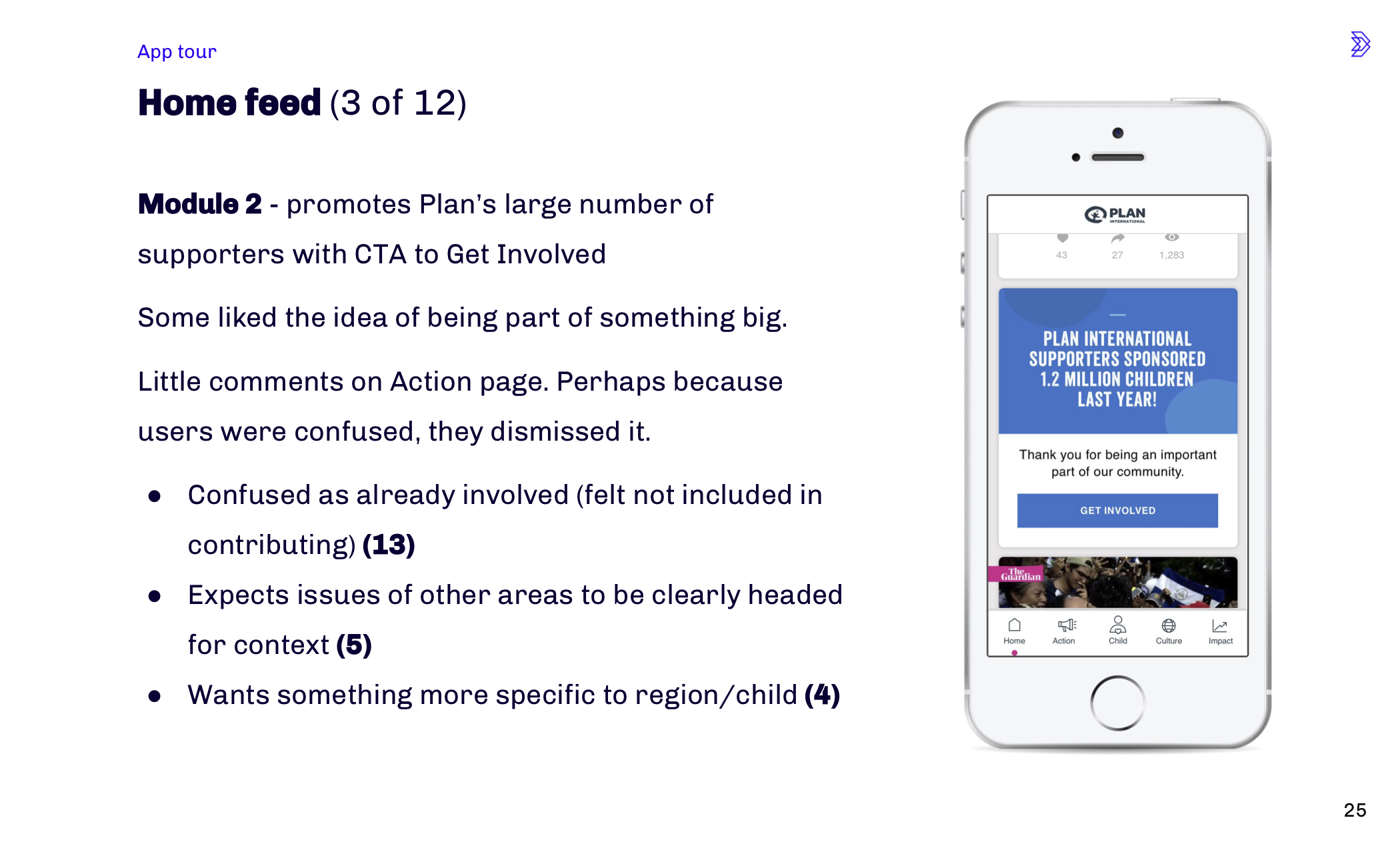
The client conducted 46 user tests and provided me with the raw observations. I broke down the observation task by task and pulled out key findings. I presented my findings, along with along with high level suggestions for improvement.
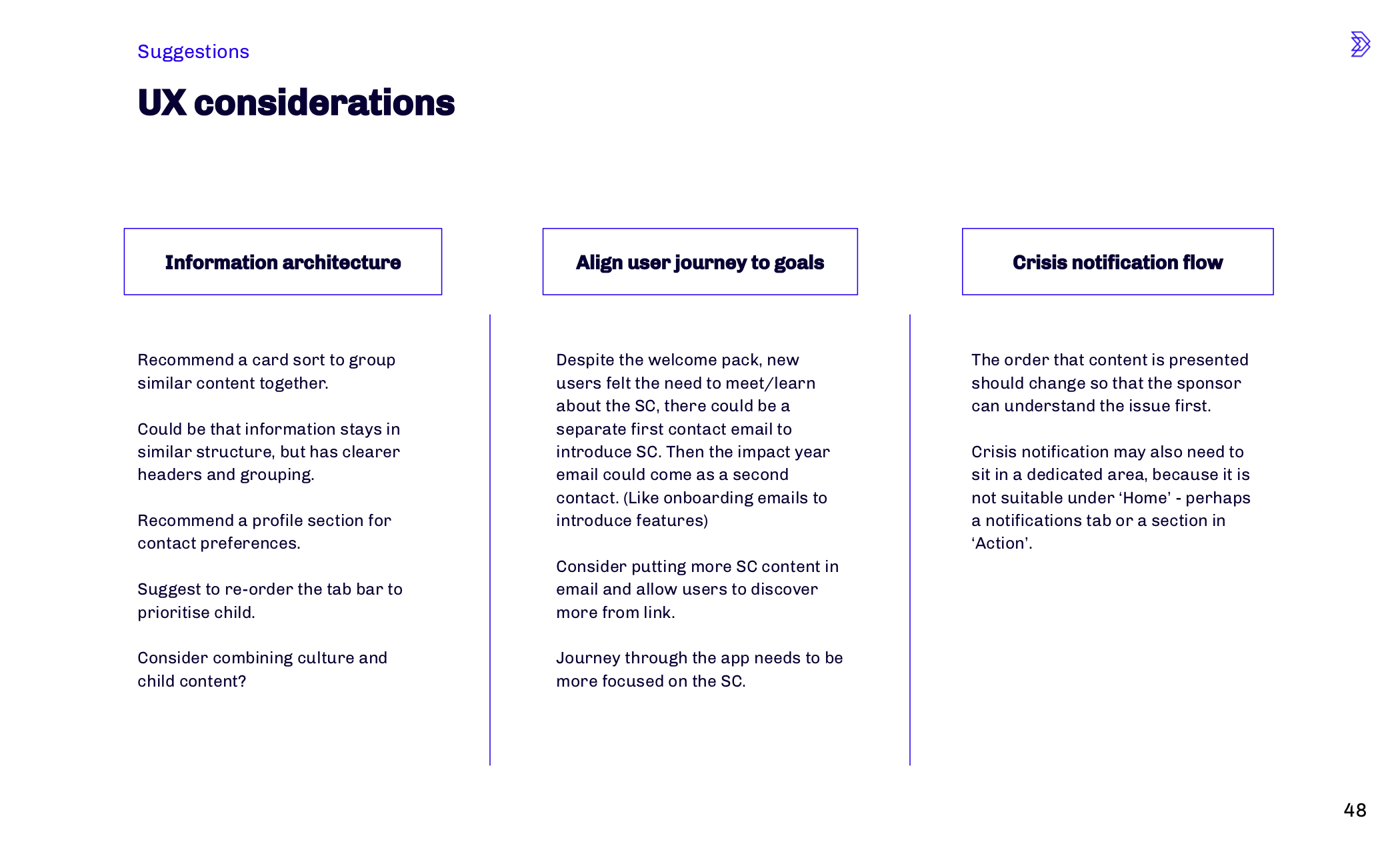
The overarching UX considerations that needed attention were:
- Information architecture
- Aligning journey to user goals
- User flow for ‘Crisis notifications’
- UX copy – particularly CTA’s
- Page layouts
- Simplifying the way the app worked for new and established sponsors
Selection of slides from user test analysis presentation
Information architecture redesign
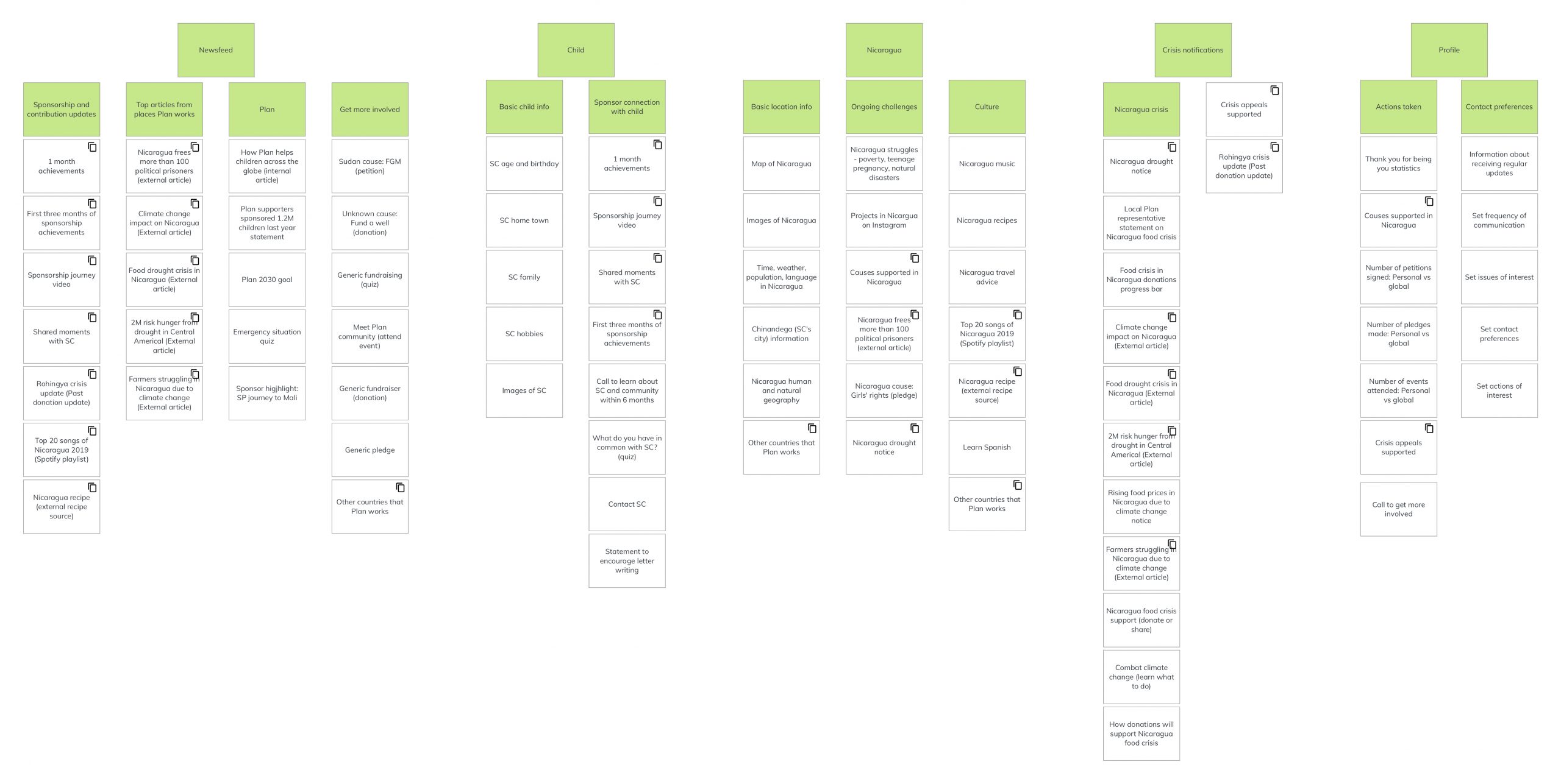
The information architecture was the most important opportunity for improvement in the app. It was confusing users and significantly disrupting the user flow. I created cards for the content and performed an open card sort to help determine an improved information architecture.
I mapped the content cards to screenshots from the app. This became the foundation for data mapping and feasibility assessment for the technical lead.
Deliverables
Component UX improvements
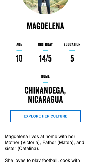
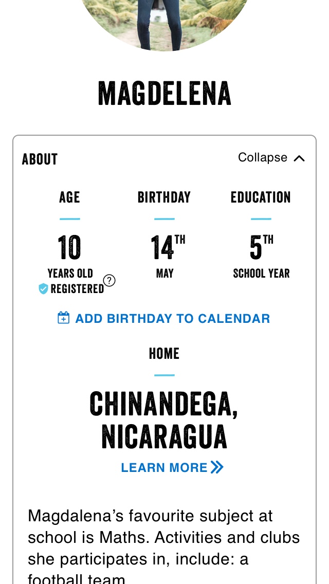
I used user feedback, my knowledge of UX best practice and the feasibility assessment to re-design most of the app’s components. This included simplifying components, applying consistent UX patterns and making actions clearer with improved labeling. I also UX copy and body copy re-wrote as required.
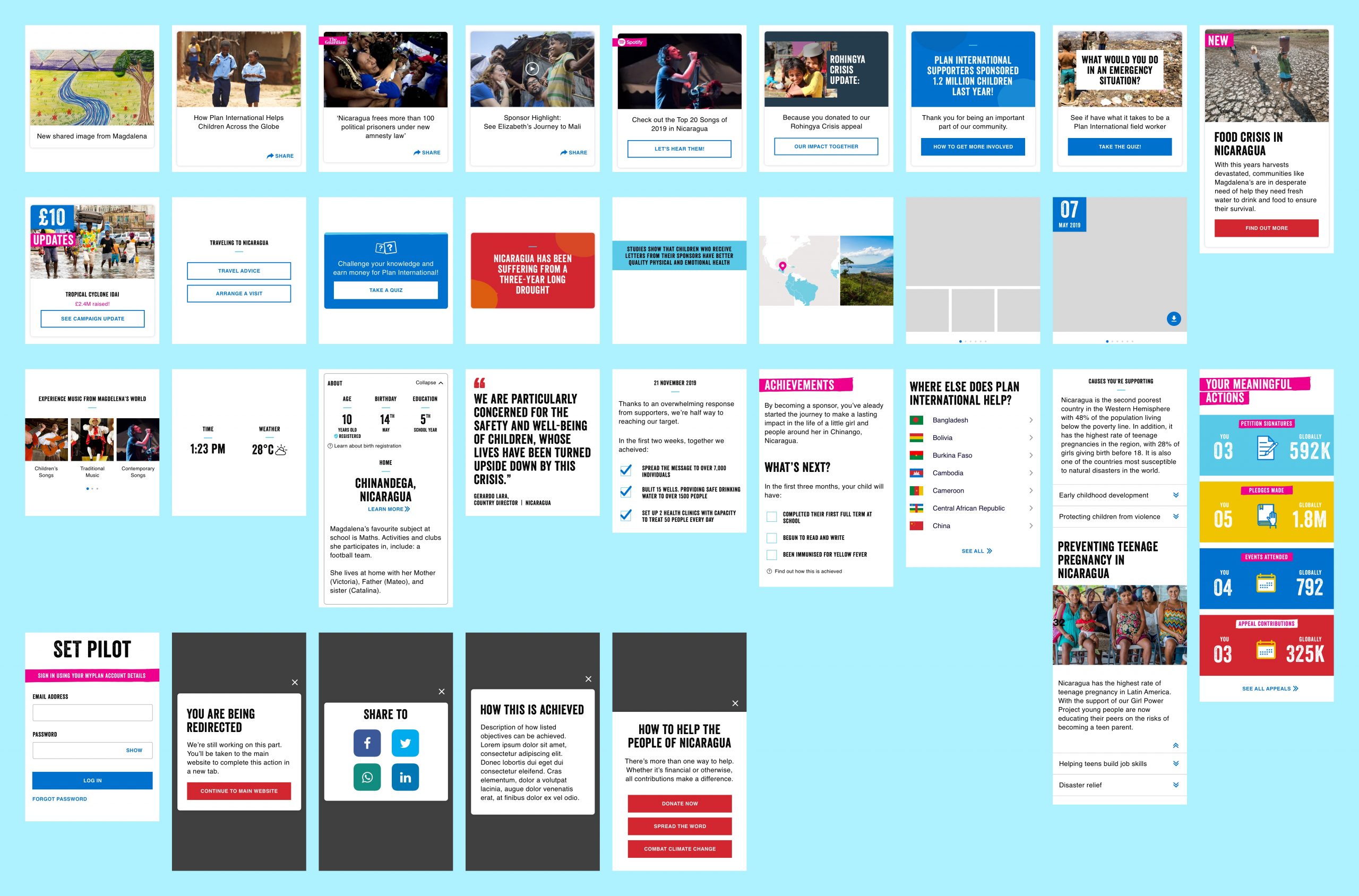
Streamlined component library
I simplified the component library from 73 components to just 31. Components were redesigned as necessary to improve UX or meet technical requirements.
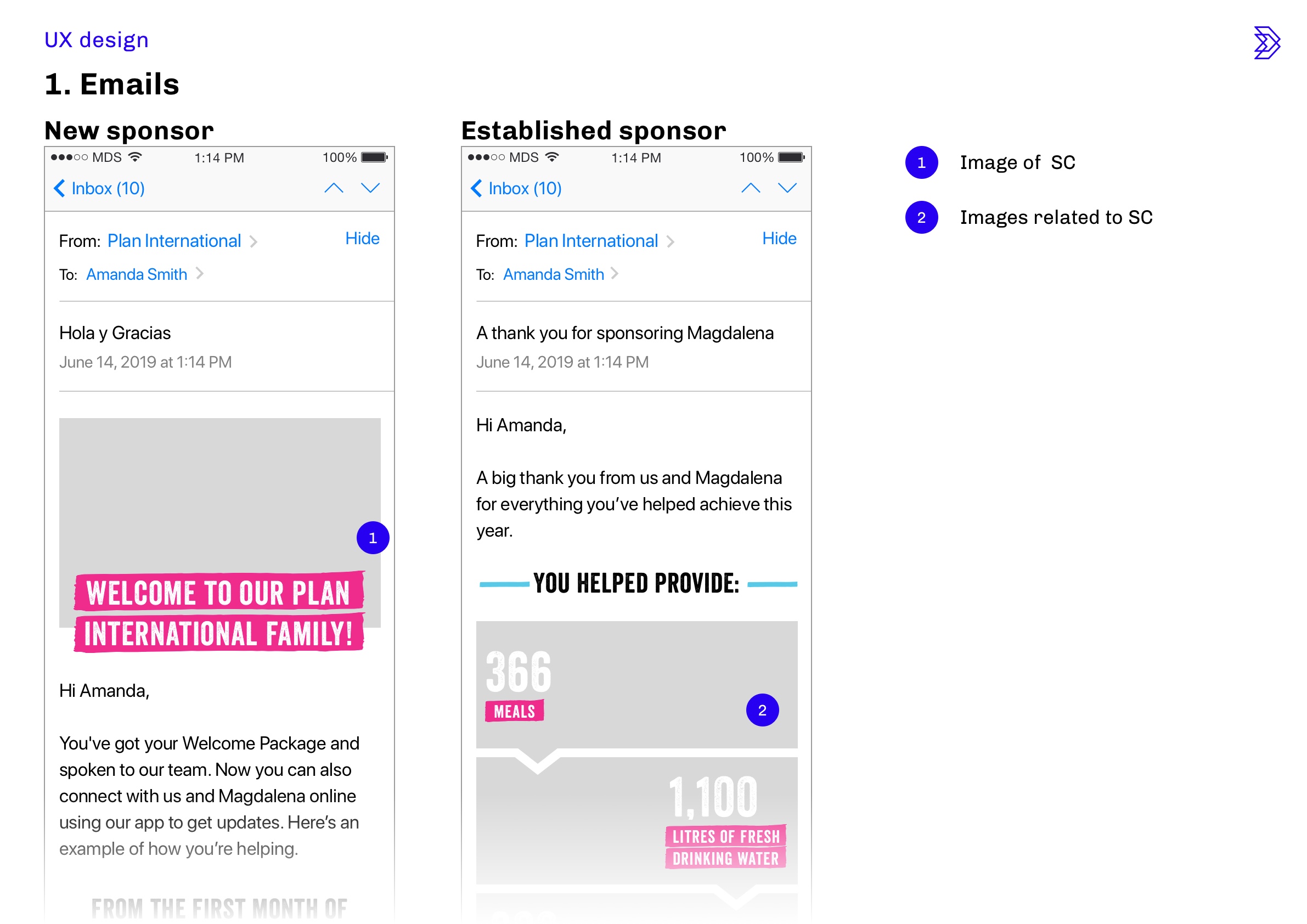
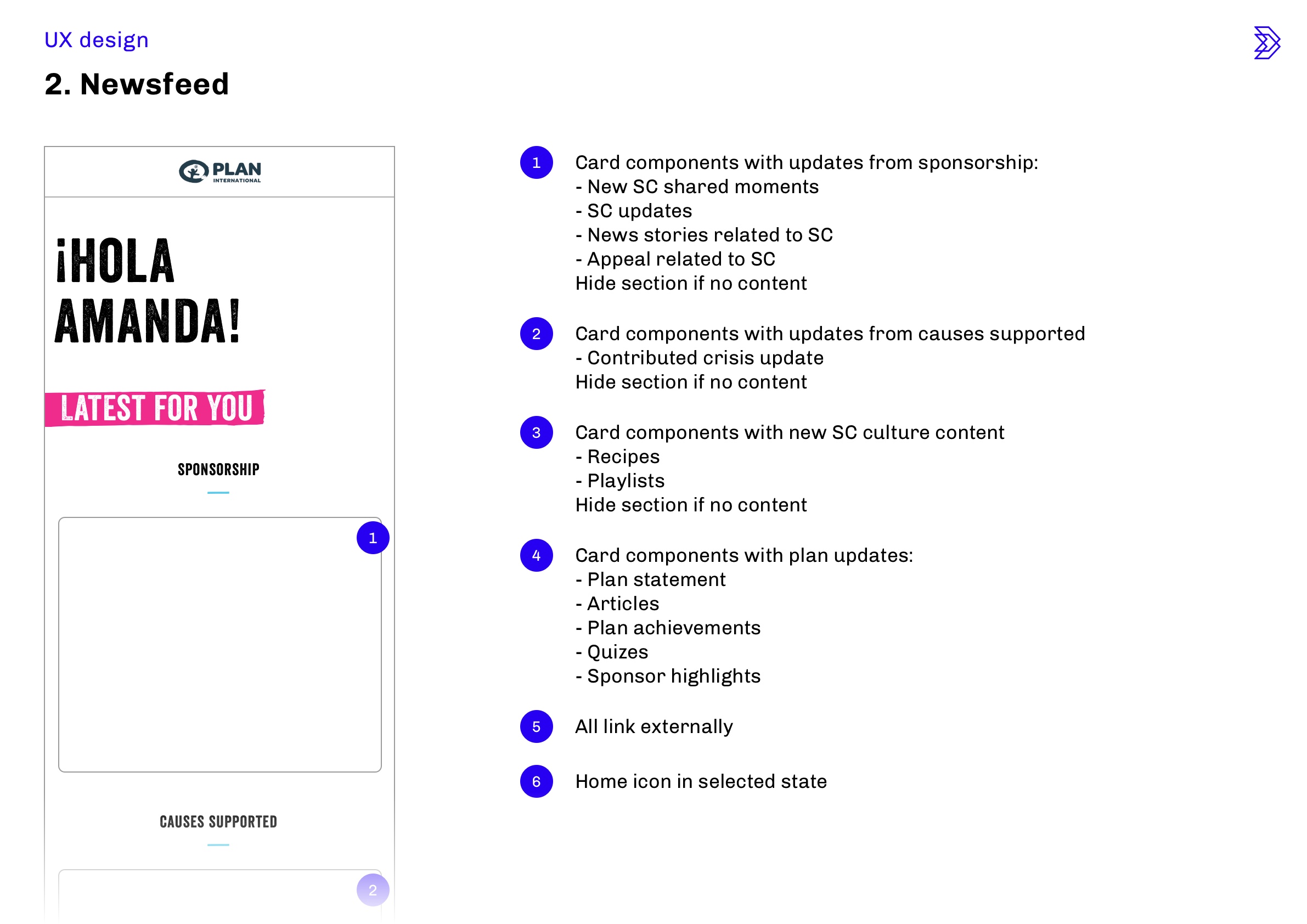
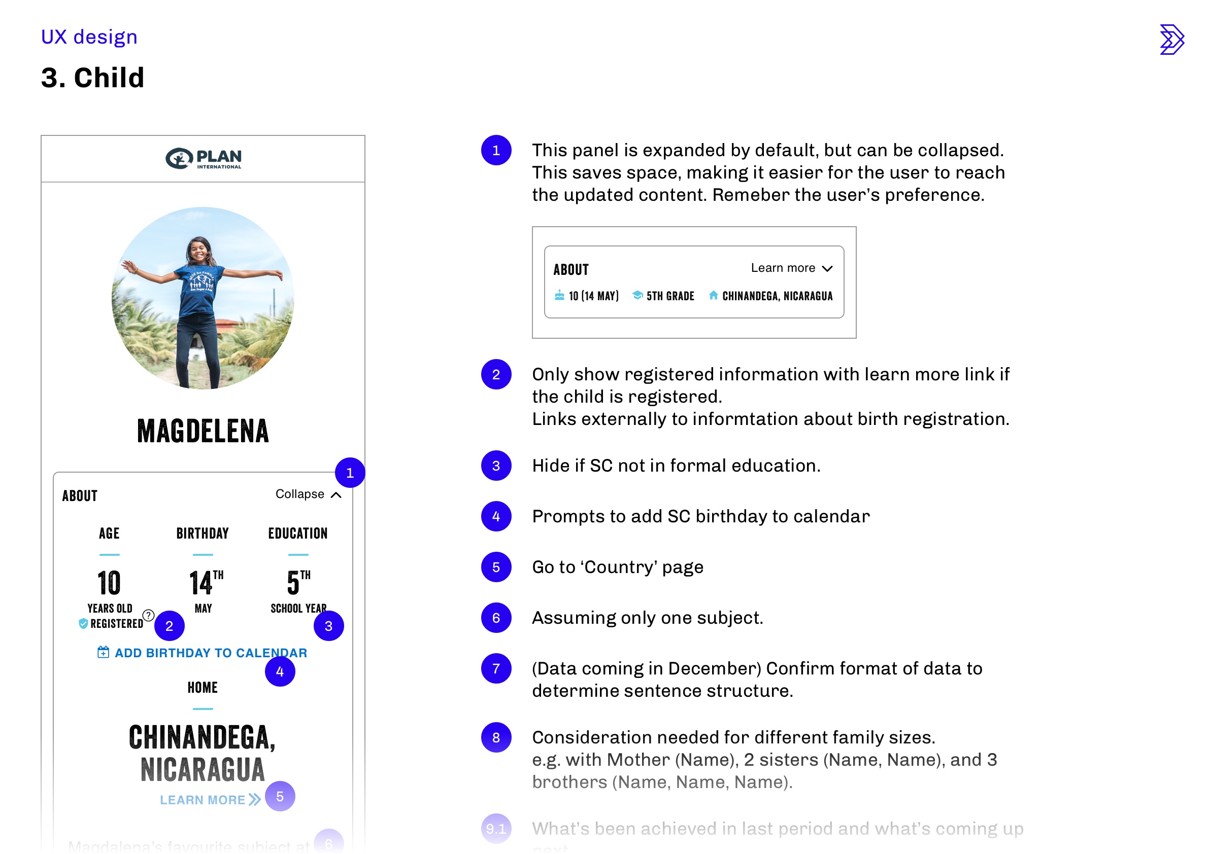
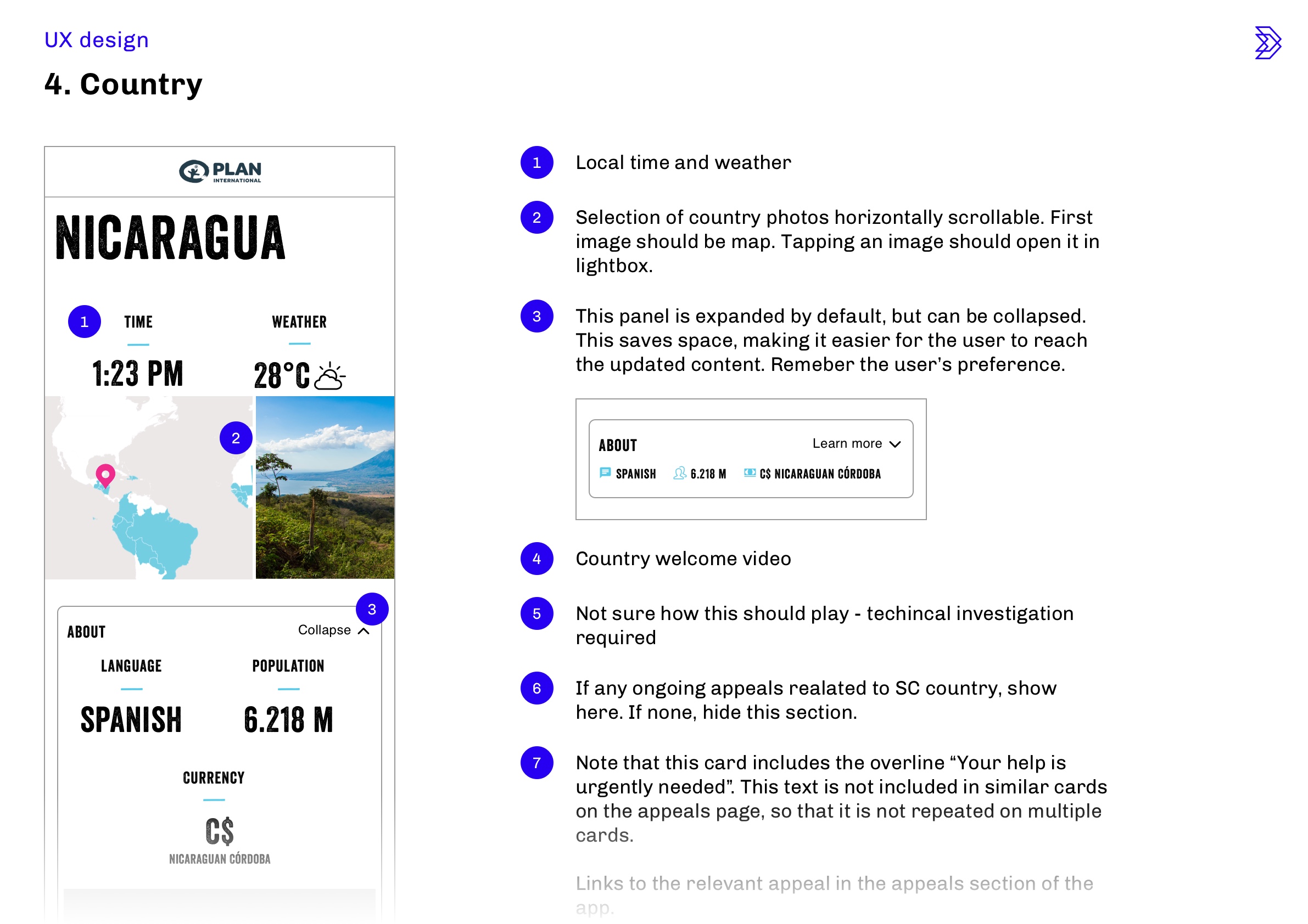
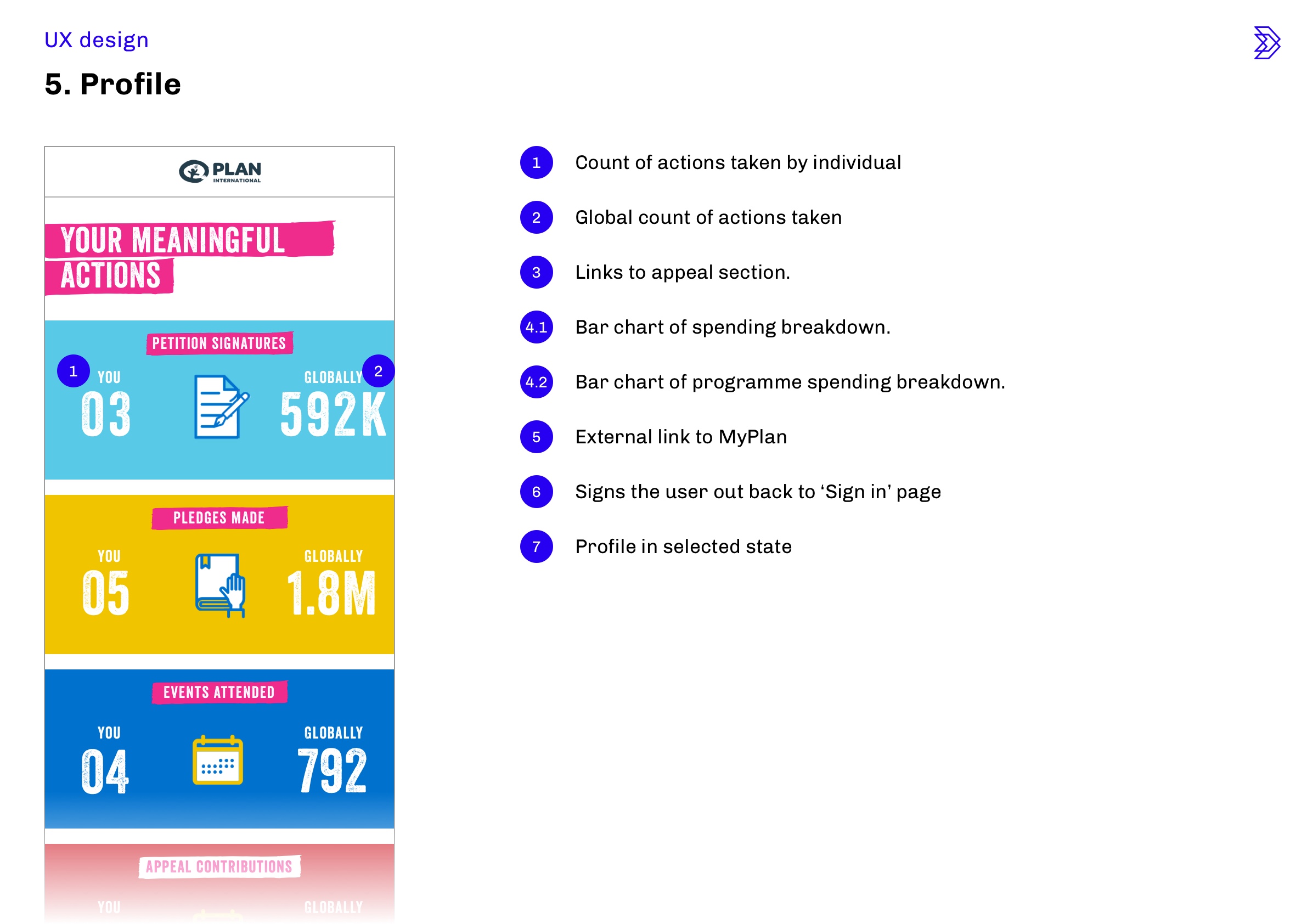
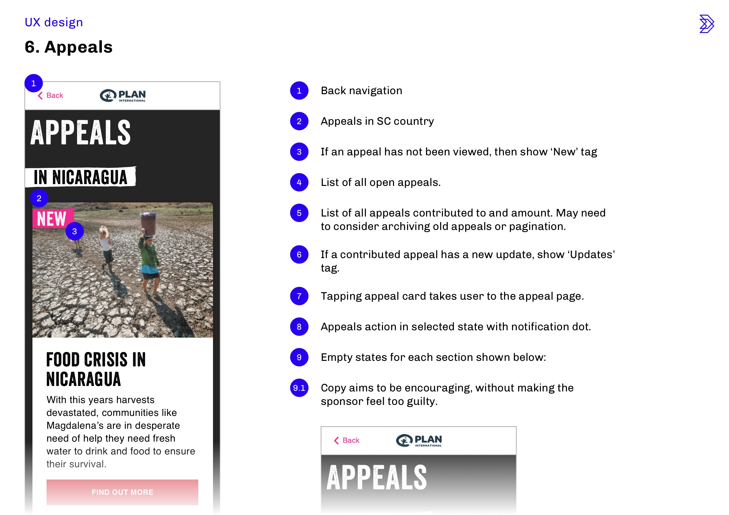
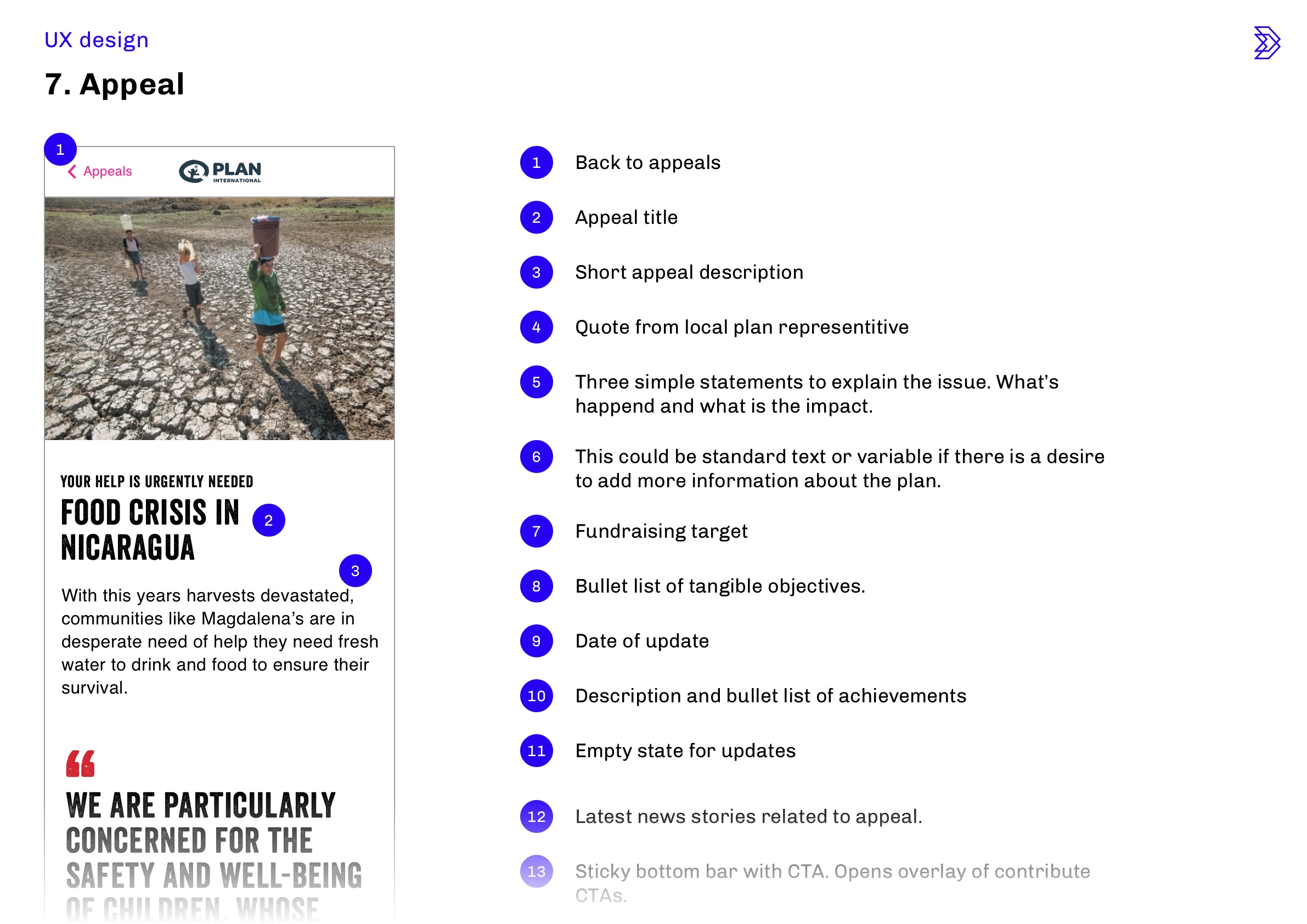
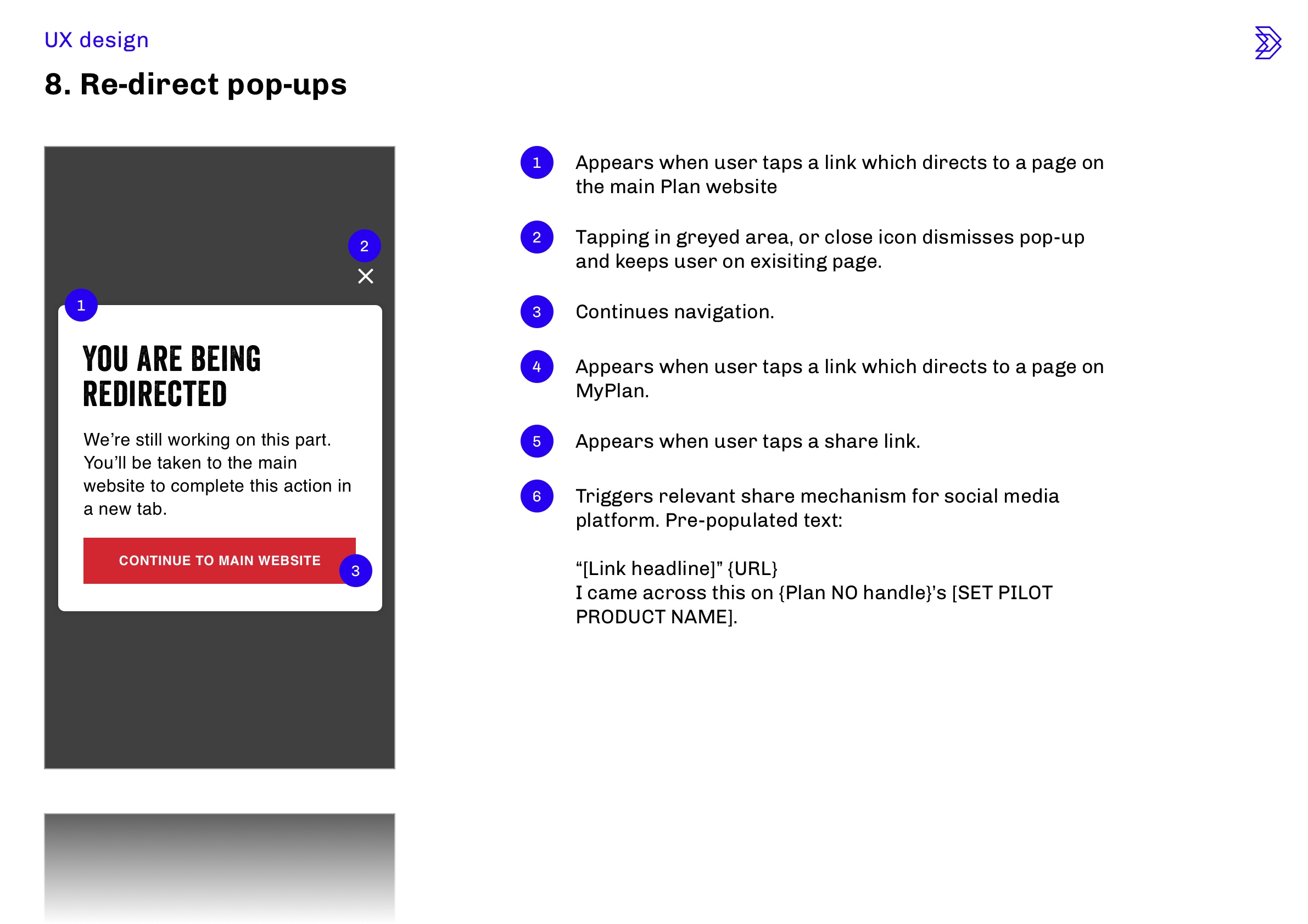
UX design documentation
I presented the full UX redesign and created detailed documentation to explain the UX and provide rationale where necessary.
UX documentation
The Creative Director said:


